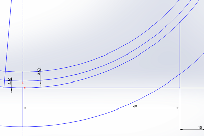
The curvature that I chose to work with was a circle of radius 84.5mm. I then translated this arc around several times, allowing myself guidelines that would serve as the outer boundaries of my work.
I've decided to include all the Solidworks work that I've done into one blog post, as this will KEEP IT SIMPLE. And save anyone who reads this (is there anyone out there?) scrolling backwards through multiple blog posts to find the content.
After tracing out my base lines, I then started with an extruded curve, and the started to chop it up. I altered my plan for the pieces of this model a bit after learning that we were able to use the Connex Multi-Material printer, which allows us to use different materials in the same printer, as well as blend the materials (rubber and hard resin) to get different material properties.
Therefore I'm doing most of my designing directly in an assembly, which will allow me to make sure everything fits perfectly. This form below forms the base hard layer of the skin level part. This holds more purification mechanics that will then feed into small ducts that will feed into the bloodstream. It also holds the base section for the filter.
The notches in the model above are for where the rubbery parts in this segment will fit. This is where the different materials will fuse together, creating a unified whole.
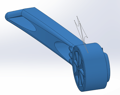
The main round section below is where the filter will connect into the form. The way I'm getting this bit to work is with a push-in-then-turn-to-lock system. The filter will have small extrusions that snake into the defined paths, allowing the filter to easily slide in and out of the hole, while also maintaining a tight seal.
The rubber in the base of the circular section will have a small rubber disc in it that will provide the resistance for the filter to push against. The multi-level locking system should ensure that the whole thing doesn't fall apart. Hopefully, at least! The small circular notches are aesthetic elements, where we could imagine the whole piece would be fused and connected.
The blue sections in the image above show the rubber segments of the part, which will serves the connection points for the outer section. The reason why I wanted to disconnect the forms rather than having one whole fused piece was to allow the user to easily take the piece off for sleeping or for other moments, as a sticking out segment might not be most conducive to that.
Another important element of being able to remove the sections would be that it would allow the user to customise the different sections with different choices for their personal preference.
The tentacle-like section serves as the interfacing element. When grafted to the face, these connection points (with valved tips) would be attached to the bloodstream, to serve two purposes. The primary function would be to feed the siphoned water from the creature (as yet un-named) into the bloodstream, while the secondary function would be to provide an electrical conduit for the creature to receive heat-based energy.
The filter is one of the most important sections of the whole project. While being the main removable filter, it also serves as a connection pin to hold the pieces together and stop them falling out. Ideally, this system should work perfectly. The emblazoned form on the top is the company logo. That's something I'll be looking into heavily for the next part of the project, namely the accompanying booklet with the supporting imagery.
Branding will definitely be a big part of that.
Another element I've built in heavily in this is the idea of customisation and choice. I think if there was a situation which required you to have a machined form on your face, you should at least be given choices for how it could look. So therefore all the individual components have the model number stamped onto them, so that a user could refer to a catalogue that would let them chose different variants of the same form.
Maybe the choices could involve anything from material to colour to form.
This shows the connection of the filter into the base layer of the piece. The notches are aesthetic again, so as to match the notches above in the logo. Ideally, the fit should be tight, but not so tight that it isn't easy to move. The gaps form part of the filtration system, and denote the points where the muck from the air could be washed out.
The section that I added next was the point where the skin would merge with the implanted device. The area around the hard (red) section of the base plate would in an ideal world be made of some sort of a carbon nano-weave scaffolding, encouraging the natural skin to grow on it, so that the overall form would be less apparent.
My next step was to design the removable portion of the whole form. It had to allow the alien life form to sit inside it comfortably, while having the connections necessary to socket into the base plate. For the actual form, I again drew heavily from the futuristic video game architecture. Harsh lines, however these lines were still dictated by overall curve I built into the form of the face. The curve is shaped both vertically and horizontally, making it nicely 3-dimensional while still being a relatively simple and linear one.
Another form that I used for the outer shell is the repetition of specific parts. The notched element is inspired by small-scale water filters, and it also provides a rhythm to the edging of the form. This notching would in an ideal world have a sort of grating on it, possibly a grating that was at a nano-scale. In a way, the intake vents of this device would be the first level sieve for air particles.
Continuing on the tradition of naming the different sections of the forms with serial numbers, this piece again has a different number. Here I also made sure that this section could smoothly sit on top of the base plate, fitting into all the right spots. The filter here has much more space as this section has to sit atop of the small curved extensions from the baseplate.
The socketing points are extruded from the back of this piece, and are actually extruded from a small recess that the other segments get to slide into. In the image above you can also see the trace outlines of the rubber forms that will be the socketing point. The points were designed in tandem, so they should fit perfectly. I just really hope I haven't made them too thin!
The inner section provided a bit of a challenge. This part has to slide easily in and out of the outer shell, as well as provide a bed for the alien life form. The circular recess for the filter to slide into also in this case gets to act as a point of grasping so that the release can be facilitated. Sliding the section out and having it actually come out smoothly is the one part I'm a bit worried about, as that's something I sadly haven't gotten around to testing.
I wanted the alien species to not really be discernible as a creature, but more to be like a moss or fungus of sorts. All it requires are the basic amenities for life, and it will do it's job. Cool. I went for a rhythmic sucker-like aesthetic on its surface. It'll be printed out in rubber, so hopefully that form will still work out well and actually look good. Time will tell.
The form is complete! Five separable sections, each with their own purpose. Overall I think I conveyed the aesthetic I want to achieve. The outer shell sits against the base plate nicely , and I made an effort to have the edges of the form slope to meet the skin, so that at the right of the form the interface point is less of a harsh difference.
The filter provides a nice full stop to the design. It is the keystone in this form. It joins all the pieces and makes sure that none of them come out. Very important stuff.


No comments:
Post a Comment