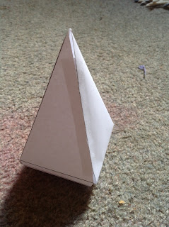
So, now that I have my form sussed, I can start making iterations of that form and come up with some clever slight variants of the shape. Since I want to keep the see shape consistent across all the forms, I really just want to manipulate the exterior of the shape mildly.
This first sketch model was to get an idea of scale. It's something that could very comfortably sit in your office on your desk, right next to your other awards, and still look appropriate. That's the look I'm going for. Something that is classy and the right size. Not too big, not too small. It still has a function to fulfil, so I can't neglect that.
These two concepts here are experiments on the idea of making the seed into a sculptural element too. The seed can sit on a table and look pretty, while still being functional. The left form is simple and experiments with a simple idea, where a hole is let into the top of the form, so that the plant can be harboured on the inside. I then expanded on this idea and made the vase into a flower-bloom inspired form, making sculptural "lips" on the form, suggestive of petals.
A third idea that I came up with was the idea of something much more interactive, where the receiver has much more control and input over what happens to her or his plant. The idea that I had (illustrated in the plasticine above) is that the form has the capability of opening and being closed, thus limiting the amount of light available to the plant and therefore it's growth.
This concept has a huge element of interactivity, which I believe will make or break this project for me. Giving the user a sense of control plays to the idea that the user is God for this plant, and has the power to create and destroy, which is synonymous with the concept of the relationship put forward to the receiver. The receiver has the opportunity to either nurture or destroy the relationship and the plant.
Moving into Solidworks, I started working on perfecting my form. One of the elements that I have to make sure stands out is the form flowing into the more obviously machined part of the vase. The natural curves need to harmonise with the harsh edges, making them make sense.
The first version of the form that I experimented with was the baseline seed shape, chopped off at the top to permit the drilling of the hole, while also allowing the plant to have a spot. The form has a vase-like form, while still maintaining a definite link to the natural. One of the edges at the bottom has a sharper corner, but I actually quite like that, as it gives the form a bit of a logical connection to the machine it was created by.
I tried to simplify the lips/petals of this form to make something a little more elegant. The form remains the same, the silhouette remains the same, however, the form has a much more definite link to a flower bud in this form. The form would almost have a much more suggestive form with regards to the sprouting plant. The plant growing out of the top is a much more logical extension of the form than in the previous form.
The top section of this model would be fully detachable and allow for complete removal, but could also be slotted into a small hole left on the main segment, so as to allow for the top piece to be attached at an angle. This interactivity would make the object much more personal and precious, as it adds an element of selective nurturing to the whole gift.
I find myself drawn to the last of the 3 designs, purely since it is much more interesting, and could incorporate a very interesting element of materiality to the project. If I used two different materials for the project, or even just treated one material in two different ways for the different sections, it would add a very interesting juxtaposition into the mix.


No comments:
Post a Comment