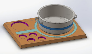
So, now that I've got my idea sussed, I decided to develop a 3D model and a render that I will be able to show my class. I'm really liking the food presentation board, as I feel like this still has a lot of potential to be a very beautiful, self-contained piece of awesome. In order to divine an aesthetic, I had a look at common forms and colours associated with heat. I want to use a clean and minimal aesthetic, using red as a significant highlight colour, but then have the red actually recede to non-existent when there is no heat at all.
So, with that in mind, I developed the first form of the Heat Indicator/Board.
This first form must have been developed when I was completely and utterly smashed, as for some strange reason, I have three completely independent components indicating the heat. Fortunately I noticed it yesterday and started working on a new and improved version, with more functionality and a simpler design. The most important element of this design is the red ring, which would activate as soon as a hot pot or pan was placed on the central plate. This panel would be of course heatproof (metal) and have a temperature gauge built into the middle, allowing that data to transmit to an arduino, which would engage the other two temperature gauges.
I still want to make a pot have its own heat indicator, as I feel like that is an intrinsic part of my vision as a whole. Plus, it gives the pot an indicator outside of the board as well, which is the direction I originally wanted to take.
So, this is how I began the design for my board. I wanted all the lighting and etcetera to be recessed and flush with the board itself, so I had to start that section first and prep the sections to receive all the parts that would make up the different materials in my render.
These are the different sections of my board laid out. The dark grey section is the heat sensing and proof plate, the black sections represent the different "interfaces that would light up and display data in the presence of heat. As for the board, I really like the nice, simple beveled shape I've used, and that just emulates the simple, minimal form I'm going for.
This is just a little overview of all the components on the board. Obviously the board's electronics would be far more complicated than that, and that's not shown here, but this is really just as an idea so that my classmates (my audience for my presentation) can get a good idea of what the project would look like.
And here's the render I devised of the first form. The materials I've used are pretty much the materials I would hope to use for the actual product, so people can get a feel for what it would look like. The pot form is based off some pots we have at home, and I just did a really simple form, to give a sense of scale.
So, after my embarrassing design oversight with the first one, I went back to the drawing board, and made some significant alterations to the form as a whole, so that the entire idea was simplified, the electronics were simplified, and the function was abstracted a bit further. The heat sensor would now transmit information as a whole across to the light ring shape, which would represent whether or not the pot was hot. How hot the pot is would be displayed in the red bars. The red bars would act as an extension of the ring, allowing the user to see how hot the pot was, based off how many of the bars were lit. When the pot started to cool down, the bars would slowly turn off, and ultimately, the ring would turn off to.
The new elements I built into this form were the recessed circular sections. These now reinforces the design as something that serves as a presentation board, as these slots would serve a function as pockets for condiments and other additives for the meal. This allows the board to become a product, rather than just a safety solution.
Another aspect I really wanted to bring into this project was switchless operation. When the pot rests on the platform, the weight of it would trigger a switch, turning the system on. This would limit the need for an ugly external switch, and ensure that the design would be as clean as possible.


No comments:
Post a Comment