One of the hardest parts of creating patterns is getting your head around loops. Loops, at first, were the complete and utter bane of my existence. But now that I understand them, they're so damn cool.
I started out experimenting with just one loop, which would let me repeat things in one direction, but then implemented a second loop inside that loop (Loopception!) so as to allow my shapes to repeat down the page as well.
I started out experimenting with just one loop, which would let me repeat things in one direction, but then implemented a second loop inside that loop (Loopception!) so as to allow my shapes to repeat down the page as well.
I started out working with some simple shapes and doing similar patterns to my work in the pattern maker, Having the loops written by me and understanding the process behind them really made a difference when it came to knowing what to do with them.
In this image I was experimenting with how I could recreate the element of water drops in a much more stylised way.
In this image I was experimenting with how I could recreate the element of water drops in a much more stylised way.
Here I switched my colour palette completely and went for greens, aiming for an effect of green leaves, coupled with a spread across the entire screen. This particular code sequence was where I decided on a slight ulterior motive. I wanted to make myself a background for my computer at uni, so I altered the code dimensions, and also the while loop conditions to suit it.
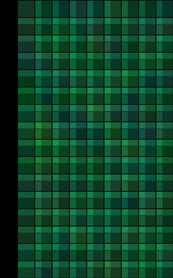
I went on and experimented with squares after the arcs, because I temporarily got bored of them, so I moved on and started creating a checked pattern. Another thing I started working with a few codes back was the alpha value of the shapes, allowing me to create an awesome layering effect.
Going back to arcs here, I went a little bit nuts and overlaid twice the arcs into one loop, also implementing them into the draw function, just to see what might happen. Since the draw part of the code refreshes every second, 60 times it overlaid everything in crazy amounts, so that you couldn't even see the background colour any more. Fail.
I pulled it back under control in this one, and regained a semblance of designed structure. The way the arcs shift as they move across was done in such a way so as to suggest a subtle curve up towards the right.
Here, again, my ulterior motive was clear. Recycling the shapes and code from the previous code sequence, I generated a wall of "leaves", softly spiralling down to the ground.
Moving away from the arcs here, I decided to try out working with some other shapes, however with the same colour palette. Triangles are another shape that is rather easy to manipulate in code.
...As demonstrated here. I played with the blue element in the colour here, both to lighten the overall colour and also to give a more dynamic element to the arrangement of the triangles.


No comments:
Post a Comment