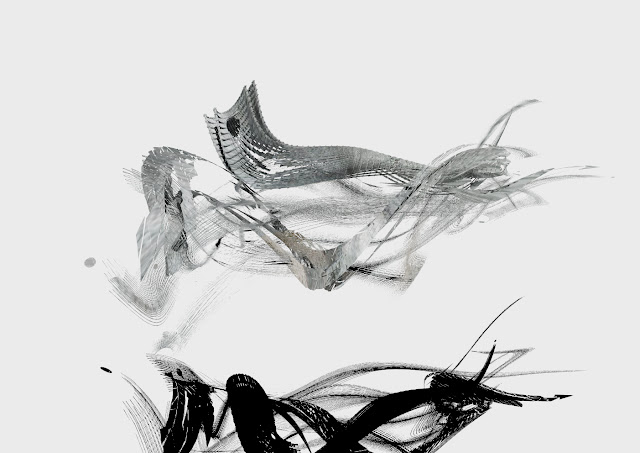
So I thought I should probably catch up with blogging about my models before it all catches up to me and lands in a big sodden heap on my head. I really do enjoy this course, despite the workload. The appeal in it for me is very much the pure creation element of it. The fact that 3dsMax allows you to create anything, it just merely gives you the tools, and says "go do it."
I love that. If you can imagine it and are good enough with the functions, you can make it.
And sometimes when you're stuck, you can just fiddle around with buttons and get some interesting results!
I love that. If you can imagine it and are good enough with the functions, you can make it.
And sometimes when you're stuck, you can just fiddle around with buttons and get some interesting results!
Model 21
This one feels like a dolphin. I find that in a way, that is the ultimate animal embodiment of my three words sinuous, fluid, motion. Maybe I'm just tired, but this one really does look like a dolphin to me. For this model I took off the lattice that I had applied to most of my models thus far, and toned it back, so as to allow the motion to shine through some more.
Model 22
For this one, I wanted to experiment with the ripple and wave function a bit, but I also used the symmetry tool. It can yield some really unexpectedly cool results if you manipulate it in the right way. The shadow almost looks cooler than the model in this one!
Model 23
For this one I took the symmetrical model and bent and squashed it, and now it almost feels like a squid of sorts. Another really good animal embodiment of my three words! The dark thick space to the right could be it's brain/extra fins.
Model 24
I twisted and bent the afore-mentioned squid into a far more abstract shape in this iteration. Here the whole shape has been transformed into a wave-like creation that is displaying a certain fluidity to it.
Model 25
I ditched the symmetry here and went with a propeller-wake inspired twisting shape. The twist shape is my best friend, because it's just so appropriate for me to work with with regards to my words.
Model 26
This model built on the idea of a more directed flow, and I also built the lattice back into one of the components of this model, so as to give the shape more substance. Having pushed apart most of the polygons in the shape, it had already lost a substantial amount of "substance", so a little bit of matter was more than appropriate.
Model 27
I tried to expand the curves a little in this model. Bring them a little bit apart so that the individual components could shine a little bit more.
Model 28
The symmetry tool here donated another welcome iteration, and it really fits with the rest. I chose the axis that made the three words stand out the most. This one has a water-flowing-around-rocks feel to it.
Model 29
I really should have left the texture on these or made them more coloured, because it's not the easiest thing to see on my white background! But still. This one I attempted to turn back on itself without destroying it, and also used the latticed piece as a feature.
Model 30
This one makes me think of the word "fleeting" for some reason. It just sprung to mind when I had a good look at the render. The long "tail" at the left makes this feel like some sort of abstract bird!And this is all of them together! Next, numbers 31- 40!


No comments:
Post a Comment