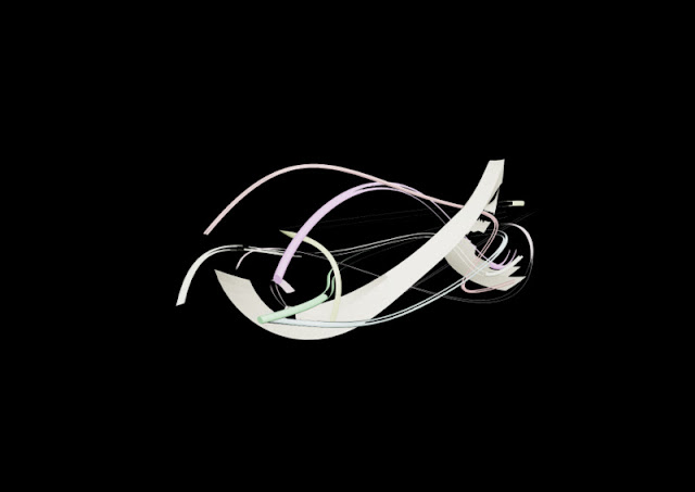
For my final presentation, I want to present my 81 in a landscape of sorts. But not an actual, real, landscape. While the forms are derivatives of natural shapes, I want them to be shown in an unnatural setting.
I thought about where I could present them and came up with the idea of displaying them on a massively enlarged surface of my first model. So, I took some of the components of my first model, and transformed them into something that would be appropriate for presenting my model on.
I wanted to do something that would still capture the essence of my words, so I worked with the extruded rectangles of my first model, and made a lot of useful surfaces, while trying to minimise the amount of black space, but still leave some for the purpose of contrast.
I played around with two different lighting set-ups, but decided I actually quite liked the shadow across the whole field, as it really gives a sense of depth and reality. I wanted to capture a similar element to when a luxurious sports car is presented at an auto convention. Namely, on a slightly reflective podium with provocative lighting.
In the final setup, I have a total of 5 lights, 4 omni lights in-scene, and one sunlight system on the right. I chose a warm hue for the omni lights, so as to add some more colour to the scene.


No comments:
Post a Comment