Showing posts with label DSDN104. Show all posts

Friday, October 19, 2012

DSDN 104: In Hindsight...

On recommendation of my marking tutors, I decided to include a combination image as well. Quickly composed on Photoshop, I think it actually captures the sense of my project really well! I'm kind of disappointed I didn't end up including it in the original submission!

Mathematics, Science, and simple geometry expressed in a single form!

Thursday, October 18, 2012

DSDN 104: Final Photos & Render!

And...this is it. Kind of scary really that I've reached the very end of one of my favourite courses. Yes it was hard at the start, yes the programs were a nightmare to learn quickly. But actually looking back, it was all absolutely worth it.

Definitely do Digital Creation if you ever get the chance. You will and at the same time won't regret it.

Anyway, this project here for me was all about the mathematical, analytical side of design. Inspired by an illusionistic Grecian façade based on simple forms, I extrapolated out the difficulty and complexity of that form. The idea of something being impossible when you look at it front on in two dimensions, but it then being completely possible in three dimensions has been absolutely at the core of this project.

The notion that something can be so simple, while hiding a massive degree of complexity is how I created my form. If you look at it and dissect it into its most basic forms, it is simply a circle that has been extruded along a complex path. But the way this path intertwines and overlaps itself is what makes this design stand out. Deceptive simplicity, all derived from a series of simple mathematical equations, values and vectors.

My render deals with the idea of a product shot, and a "perfect" composition. I tried to perfectly balance the image with the structuring of the models,  as well as balancing the shadows all around the models. The duality of the shadows, and the resulting overlaps forms a dark, evocative scene that speaks of a dynamic, translucent model with a material that immediately connects the model with the render.

Final Render 2.tif
The Final Render

The elements that I tried to capture in my photos were meant to be a juxtaposition to the render. While in the render I tried to create as much of a product shot as possible, in the photographs, I made a much more obvious link with the projects design and it's mathematical roots, while exploiting an emotional tie to the model itself.

The sketchbook detailing the derived angles and inflections in the design just makes sense as a stage. Mathematics doesn't change. The interior angle of a heptagon will always be 128.571 degrees, and this was what I was trying to convey in the second shot. Mathematics doesn't change, it can only change in the way it is expressed.

In some respects, the way I designed the model is almost representative of the way data can be presented visually. If you pare it back to the basic data and vectors that create the shape, it is presenting the data for a specific type of heptagonal star in a 3-D, tangible space.

For the first and third photos, I tried to capture both elements of craft and elements of rhythm that exist in my design. Craft is interesting, as the whole point of 3-D printing (in my eyes) is that is removes the element of craft. Something is machined, it's always going to be the same, and yet I've refined my model further by applying a degree of craft to it. Sanding parts of the model in one way and then other parts an alternate way has given the project a dynamic element of craft that results in a unique visual experience of the layers being featured and hidden mere millimetres away from each other.

Image 1 

Image 2

Image 3

I'm really proud of this project! :3

DSDN 104: Photo Favourites!

Now that I've taken my photos, it's time to narrow it down to the best of the best. The images that I want to achieve are images that show hidden elements of the model, as well as shots that display the general theme and inspiration for the images.

.
This shot here shows some of the craft that I built in to the model. For the outer main legs of the model, I sanded them soft and like frosted glass, while the inner struts I sanded lightly along the "grain" of the 3-D printer. I tried to show that off in this shot.

.
Trying for a more elongated shot, I wanted to capture the vertical height as well as improve the overall composition of the previous shot.

.
This shot explores the concept of rhythm in the Hepta-Knot. The heptagonal design results in a consistent rhythm around the models exterior and interior.

.
Experimenting with different lighting, I tried illuminating the model from behind, which gives it a totally different feel. I actually find that it cheapens the model a little bit, because I associate the white plastic look with the cheaper 3-D printers that are available to us.

IMG_1453
For this shot, I explored the connection between the model and it's design. My sketchbook was the perfect backdrop to achieve the connection of the model and the maths behind it.

IMG_1454
Trying to capture the sense that was achieved in my most recent render, I wanted to duplicate some of the inherent translucency of the models materiality.

DSDN 104: Show ALL The Photos!

So, I've taken all my photos! Feast yer ayes on that which be sweet!

Contact Sheet-1

Contact Sheet-2

Tuesday, October 16, 2012

DSDN 104: Final Render Developments

So, now that I've got my composition nailed, I can start perfecting my rendering. I've decided to go with a material that best emulates the material that the actual model is made of in real life. Sadly I'm having to create that material myself, so we'll see how it goes!

Compos Render 1
This first render is the ideal sort of colour I want for my main model. It's pretty much the colour my model has come out as, the only problem being though that this material isn't transparent at all, which is a bit of an issue, considering my model is pretty much translucent.

Compos Render 2
This render shows the main model is now a lot more transparent, however it's pretty much lost any semblance of colour, and it's also letting a lot more light through than I want it to. The light is completely splashed all over the sides of both of the other models, and they seem to lose a certain degree of their depth, too.

Compos Render 3
This render here is definitely starting to head down the right track. The material is sort of starting to take on the shade that I want, and the amount of light starting to fall through is really good. However, it's still got a bit of a grain to it, and doesn't really have the frosted glass look that I'm going for at present.

Compos Render 4
This one is almost there. The colour is perfect, and the transparency is jsut right. However, the surface is still too damn reflective! A frosted-feeling model shouldn't be reflecting like that at all.

Compos Render 5
Ahhhh...now this is what I'm looking for! That render could quite literally be the actual model sitting there. I'm actually very lucky that I managed to get the material to this point! However, for the final render, I want the proportions to feel even more stretched, so I think I'll pull the top edge of the render down a tiny bit, just to pull the models up the frame a little and make the image feel even wider.

Final Render
I pretty much maxed out all all the settings for this render. And it really does look amazing, but I feel like I've cropped away too much of the top layer now. The image feels a little bit short. So for my final final render, I'll give it a little more in height, but not as much as was had before. I also get an ever so slight vibe that the image isn't centred and that the shadows at the bottom of the image aren't quite parallel. So, some minuscule things to fix up for the ultimate render!

DSDN 104: Concepts For Photography

So, for this project I decided I would have a look at some photography precedents as inspiration. I found some 3D printed objects that had been photographed in interesting ways, but that were also beautiful in their own right.

One of the things that I have begun to realise when looking at these images is that there is a major difference between a product shot and a shot that is really trying to sell the product. And yes, there is a difference. There are amazing product shots, and often these look simply stunning. They simply show the product with perfect lighting and shadow and how perfect it is.


Sometimes however, this isn't always the best thing. Yes, product shots show the product in it's most flattering light, but that might not be what you want to achieve with the look of your product. Maybe your product is about getting dirty. Maybe its ability to stand up to the weather is what you're trying to show. Maybe you're trying to show the inspirational elements for the product's design, in which case it might be presented outside in the midst of a plant, since it was inspired by a flower, or possibly it was inspired by the water, so maybe it needs to be in water to convey that meaning?

Image acquired from: http://www.3ders.org

This flowing blue piece could possibly have had a more interesting setting to convey its roots far stronger. We really don't get very much from where it is presented in this product shot.

Image acquired from: http://www.shapeways.com

Products serve a purpose, so maybe showing how they get used would be the ideal photo? This cutlery set that was 3D printed in silver shows a clear purpose, and seeing it in action makes this such an effective piece of photography. I love this cutlery set. It conveys perfectly the idea of loss of structure and decay, which is exactly what you don't want to associate with your food.

Ideas!

Thursday, October 11, 2012

DSDN 104: Figuring Out Composition

So, now that I've started to work on my final render, which will be the basis for my photography, as the model can still be manipulated to suit my needs. Since I'm going to be rendering all 3 of my models together, I had best start now, so as to get into the groove of what it'll be like to compose each render, etc.

Composition Render 1
I actually really really like this first render of the three. Expanding on my lighting techniques from one of my previous posts, I laid out my models in a very linear fashion. Nigh on no colour, just the simple standard material, but it looks really good! My tutor suggested that I try a wider, more elongated canvas, so that I could catch all the shadows, a crucial part of my concept.

Composition Render 2

For this render, I turned back to my dear friend; Caustics. The thing I'm really pleased worked well was the white saw-blade style star at the base of the model. This point of intense brightness draws the eyes of the user in, and the dappled light all over the stages looks really neat. Possibly may need to tone down the caustics a little, as it can be a bit distracting.

Composition Render 3
Here I manipulated size of the main model a bit, so as to play with the concept of hierarchy. Another thing I did was move the camera very far away and then zoom in. This gives the sense of depth and dimensions a totally different feel to it. The smaller models look like they are leaning away from the main model, giving it and its shadow shape in a sense.

Composition Render 4

I altered the size of the outer two models for this render, testing to see if I could get them closer to the main models, while at the same time not interfering with the shadows of that model. The result is really nice, although I think I need to make the outer models a bit smaller. They feel as if they are taking up a bit too much space and  interfering with the feel of the shadows.

Lots to think about!

Wednesday, October 10, 2012

DSDN 104: Extricating The Model!

Ahhhh! I finally received my model back. A small, yellow blob of jelly-ish nothing. It looks rather insignificant when you first get it back, but the cool thing is you know that somewhere inside that blob, your resin-based model is hidden.

So I first started getting the model out by scraping at it with my fingernails through the little plastic bag it came in. Oddly satisfying and grungy, seeing the jelly material fall away from ones model is very pleasing.

This is as far as I got using my fingernails on the model. You can already start to see the form being revealed around the edges. As soon as you reach the actual model, you notice an immediate difference through the texture and hardness of the surface, so it's much easier than it looks.

The jelly material falls away as this odd crumbly matter that still has a jelly texture to each one of the pieces. It's a hell of a mess to clean up, so containing the mess is very important.

And this is what the model looks like just prior to going into the sodium hydroxide solution. This solution will get rid of any excess jelly that is difficult to remove from the surface by hand. The form is now very very clear to see, and now it's simply a waiting game!

DSDN 104: Material Experiments

Since last time I tried out a variety of lighting positions, in this post, I'll be looking at what sort of materials might be nice to render with. I actually don't like using images and then applying a UWV map. I really liek the materials that pre-exist in 3dsMax' material library. The settings on those are already pre-defined, so it takes minimal toying around to get an ideal result.

For this render set, I kept the overall composition similar, only changing the material for one model, keeping the other two in the same material, so as to have a point of reference.

Applying a chrome material to the cube clearly shows how it would reflect the other two models next to it. However, I'm not going to be able to plate my final model in chrome in real life, so this might not be the most ideal material to explore in renders.

For this render, I made the main model out of stone, so that gives a totally different look for the model. Shadows on the model look very different, and there is only a small amount of colour splash on the ground near the model. Interesting.

Since I love glass, I just had to have a render in glass on here. This glass is menat to be a bronze-y colour, and is suuuuuper reflective. I've managed to get my hands on an actual 3-D printed model from that printer, and it seems that the way things come out of that printer is more of a frosted glass look, so I think that's probably something I should explore.

For this render, I went and tried out the material oil, which yielded very interesting results. The oil has that slick look that is almost common with some other forms of resin, so it's starting to look more and more like something that I'd be able to pick up from the 3-D printer.

Tuesday, October 9, 2012

DSDN 104: Lighting Render Experiments

In accordance with the law that is the weekly schedule, I have started to experiment with a set of different rendering techniques. One of the things that I've often looked at in my previous renders is the idea of strong shadows working to conceal or reveal certain elements of the models.

Again, this use of the light can also conceal or revel elements of the material choices as well. The structure of the models as models as well as in relation to each other is crucial in these decisions. I have however finally managed to decided on 3 final models which is great.

The first one is the first model from the cuboid set, where I explored the notion of the transformed individual, extruding and making extensive use of patterns of design on the form.

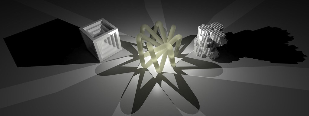
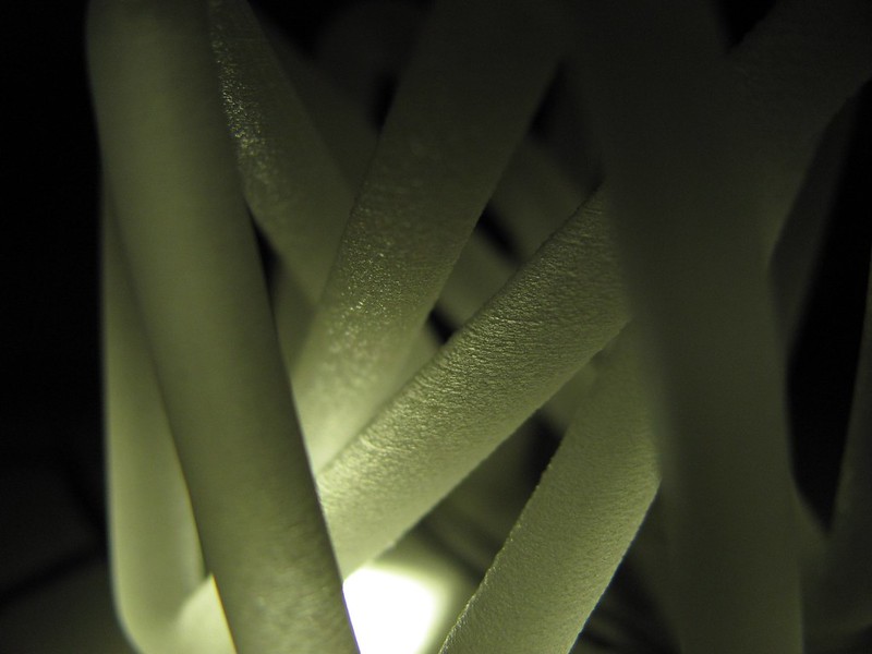
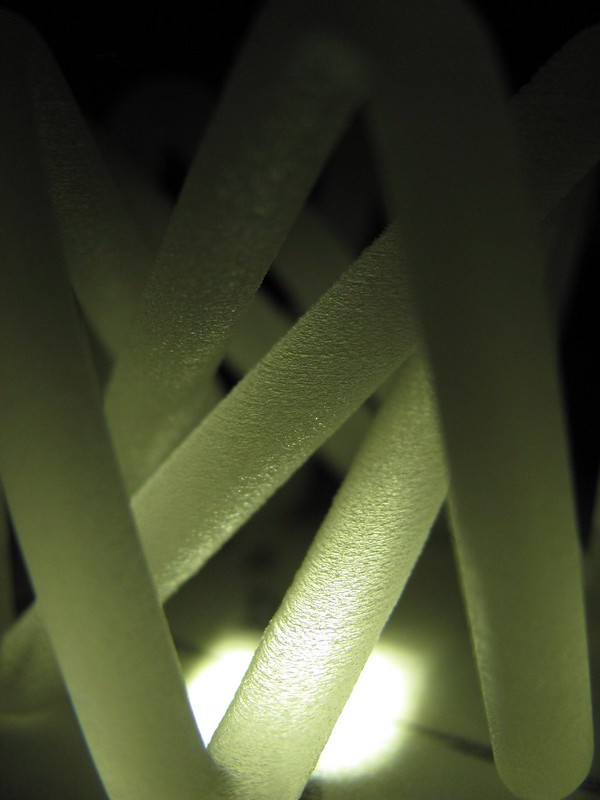
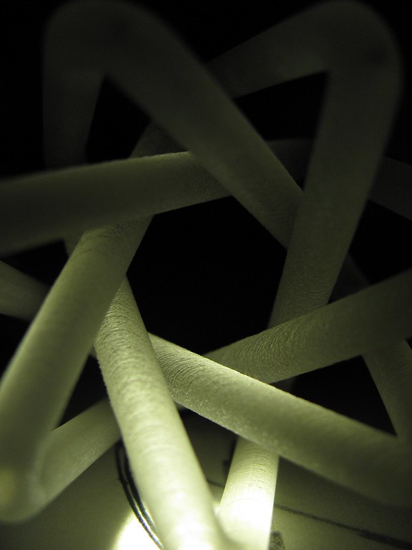
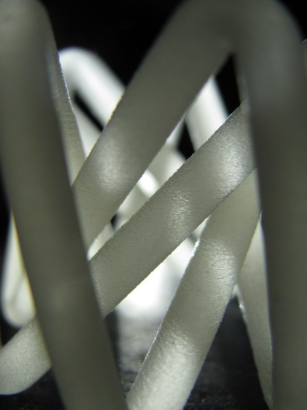
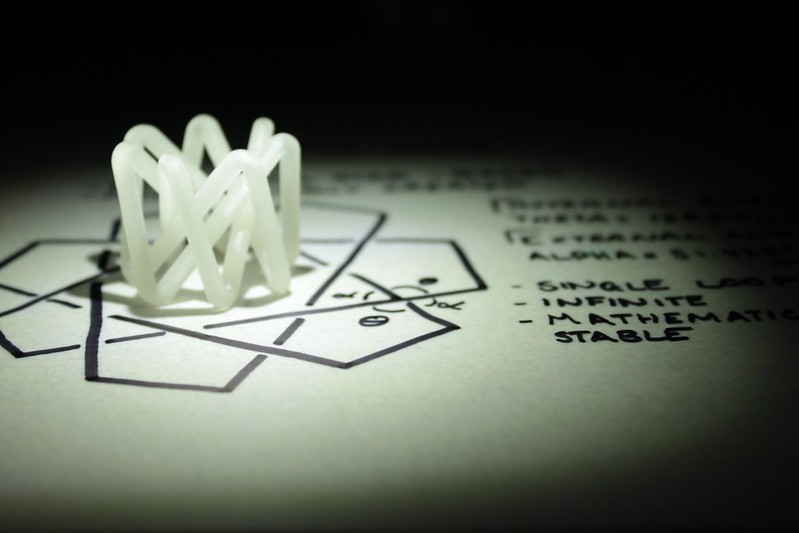
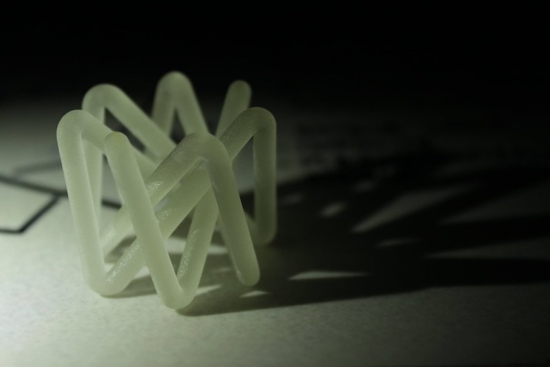
The second model is the Hepta-Knot, where I played with the idea of the model generating a 2-D form that looks impossible, but then making a 3-D possibility.The clean simplicity and rhythm of this model make it a clear favourite.

The third model explored the notion of the many making up the one. The hexagonal grid forming the texture or lattice for the individual hexagons of the spiral to be made of, which then form their own massive hexagon in the whole model when viewed from the top. The ideas of this meta-information making up a larger entity is very enticing.

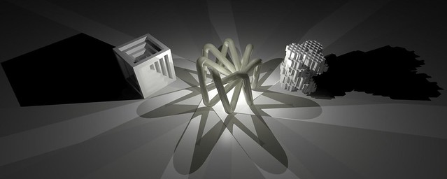
For the first 3 renders, I kept the models in exactly the same position, and only manipulated the lights to create a myriad of different effects and emphases. The strong shadows and the simple standard materials on the models actually make all these renders very successful in their own right. I really like the monochromatic clean-ness of the models.

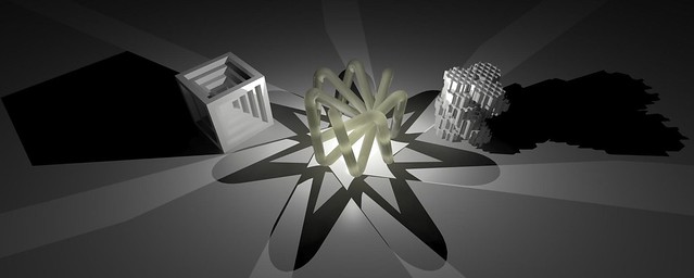
This first render has the light placed just above the central model, casting strong shadows away from the central model. Giving it a clear hierarchy, the shadows make the model feels larger and more signifcant than the other two. The obvious strength of the shadows draw the eyes up towards the central model.

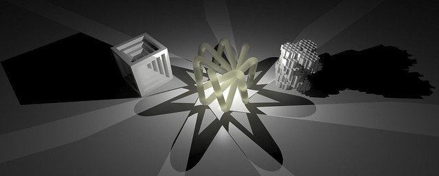
Creating a certain power, a feeling of energy and strength, this render has the light inside the main model, casting the light outwards in sharp shapes, obscurintg the other models in heavy shadows. The key part of this shot is that the main model is stillvery visible, but has the ultimate position of power in the render. The main model in a sense has the power of the sun in its control.

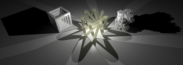
For this render, I wanted the cube on the left to feel like some sort of chalice for the light, and what's been achieved is a scene that almost feels like the sun is rising. The long shadows makes it feel like early in the morning. The thing I love the most about this render is the reflective quality of the standard material and how it has the dappled reflection of light between the cuboid model on the left and the main model in the middle.

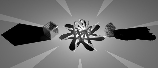
Trying out a different arrangment, this render gives no special significance to any of the models. The way they are arranged feels a little haphazard, but that is intentional. This arrangment feels like the models have just been caught doing something bad, and are glaring back into the bright light of the torch.

Now, on to some material experiments!

Monday, October 8, 2012

DSDN 104: Experimentation With Printing!

So, since I've made the executive decision to ditch the hexagonal model and roll with the Hepta-Knot, I decided to try and print out a larger scale version of it on the UP! printers we have here in the First Year Studio. These printers print in plastic as opposed to the resin and are much cheaper and correspondingly also a much lower quality/resolution.

That said though, they still very much suit my purpose and will give me a good idea of what 3-D printing is like. Far out the technology is fascinating. There is something just so stunningly cool about being able to create something on the computer and then have literally no input from there till the machine finishes it.

The plastic is actually surprisingly hard and strong, while still maintaining the support material in a much weaker state. It's pretty easy to see the ribbing on the model though, where the plastic has been layered up and up. It would be a good idea to sandpaper this model just to get the smooth finish I desire.

Another problem (that I chose not to photograph) was the fact that the printer actually broke the model. I presume the heat warped it out of shape, or the printer head knocked it, and one of the legs of the model didn't join up with its other piece. Ah well, it's only a practice model.


I also printed the Penta-Knot, just to see how that baby would turn out. This one is interestingly a lot more solid and structural than the 7-sided one, but that's mostly due to the cross beams in it that provide support.

Again this model also captures the illusion I really want to achieve rather well. I might want to sand this model to get a smoother finish.

Either of these models would have been viable options for the final model, but I like the Hepta-Knot more because it looks much cleaner and feels like it has significantly more rhythm and structure to it. The way that it flows, but with a strong edginess to it makes it feel quite powerful, and of course the illusions still comes across perfectly.

Thursday, October 4, 2012

DSDN 104: Trial & Trepidation

After hours and hours of work, I finally managed to hand a file in today that worked, with zero errors. That said, as soon as I came home and opened up the file on my computer and ran the check again, the file came up as having 8'000 errors. (Insert expletives here) So it's back to the drawing board for now. I'm going to keep slaving on this model, because it is definitely my favourite out of all of mine so far, tied with the Hepta-Knot.

On the upside though, I did manage to get a pretty sweet render of my model, using the chrome material that I really like and implemented many times successfully in the past. Interestingly though the texture of the hexagons on top is a little bit lost due to the light patterns. However the overall form comes through really well.

So after much work (at least 8 hours), I managed to delete all of the visible excess lines, which I believe were causing some of the main problems with my errors. So I cleaned up all of the excess. Another problem that I tried to solve was making all the faces the same and face the correct way, due to the way computers compute the sides.

But sadly, all of these fixes still resulted in a model that wouldn't work. The frustration level is over 9000. So I went to my second favourite model, the Hepta-Knot. This baby was designed straight in Solidworks, so I know it will work. Ultimately it also goes with my initial precedents much more successfully, showing the illusion of a 2-D impossibility, while becoming a 3-D reality.

Definitely 3-D printable!

Wednesday, October 3, 2012

DSDN 104: Enhancing Final Hexagons

So, for my final model, I'm seeking to enhance one of the hexagonal models that I've already done. The way in which I want to enhance this puppy is by re-applying itself as an overlay onto itself. So I'm continuing on with the idea of the many making up the large.

So, first I started out with the concept of the hexagons interlacing the stacked hexagon model I had before. I created a hexagonal grid with hexagons extruded the same height as the model I had prior. Then, after creating the grid, I intersected the hexagons with the hexagons (oh the meta-ness!) and created a form.

Because things are never as easy as they could be, the structure that I had intersecting resulted in me then having to delete all the excess around the outer edges of the model, so that there were no extra lines leaving the model. 3-D printers are finicky and won't print anything that has open faces or edge problems.

Slowly I worked away at the form, peeling and deleting away all the excess shapes and layers. It was a very slow and arduous process. The overall hexagons however were slowly becoming visible due to the imposed lines of the main hexagon frame, which run the full height of the model. The model feels insanely complex, and hopefully it will work in the end for 3-D printing.

Now the form becomes visible. Stripping back all the excess, there is now something that stands as an interesting shape with intriguing form. The hexagon grid cut in a myriad of different ways suggests form, it implies how the shapes will look.

I tried bringing the model then into 3dsMax once it was completed. The model looks really good and definitely conveys the idea of the many making the compound which I want to carry across in this set of models, which is ultimately embodied by this model.

This screen capture from Max shows all the errors inherent in the model, so obviously it's a pretty tricky fix. Everything that is red shows some sort of error, so there are a lot. But I took the screen capture because I thought it was actually rather pretty. The rhythm and structure of the shapes makes for a really intriguing image.

Tuesday, October 2, 2012

DSDN 104: The Cube Monster Returns

So, with the return of the cube monster, I wanted to explore some more diamond-shaped symmetry, and as a result came up with a form that is based around single cubes, justlike the others in its branch. The cubes form the entire model, and again explore the idea of iterative design. The small working together to create the large.

In a way, this piece feels like a little die. An eight-sided die of awesomeness!

Again I designed this in Sketchup. I could have done it in Solidworks, but I decided in stead to do it in Sketchup, because Solidworks is a little bit tricky when it comes to an assembly. I'm still trying to maintain an element of simplicity, but one that hides an element of complexity to it.


The render turned out pretty well! The model, again being more angular, suits the chrome surface really well. I actually had to tone down the reflectivity because it was way too difficult to see what was the model and what wasn't.