Showing posts with label Inspiration. Show all posts

Monday, July 28, 2014

INDN 342: CAD/CAM Techniques

The CAD/CAM technique that I'm looking at utilizing for my project is CNC routing. I think routing has a lot of possibilities and a lot I can glean from it in terms of clever ideas. Unfortunately a lot of the designs that I see using it just use it as a big laser cutter, which in my opinion is a significant shortcoming of what the CNC router is capable of. Utilizing the capabilities of the router, the user is actually able to sculpt the material they decide to use.

Image acquired from: http://pirwi.com/english/Products/field/

You can see why I feel it's a shame that most of the designers on the internet have used the router in a way that doesn't express its capabilities to a full extent. The furniture that people have created is wonderfully beautiful, but it just seems a shame that it hasn't been used in a meaningful way to create new stuff. Utilizing the stacking technique to create pieces of furniture is also an incredibly wasteful process that doesn't actually express the potential of the material. In my mine the material is only a means to an end, and serves out its life as small piece as part of a much larger team of pieces.

Image acquired from: http://www.woodfordtooling.com/craftpro-router-cutters/

These joins on the other hand turn the material into much more interesting pieces of furniture. The expression of what the material is capable of and how it can be made beautiful is actually really pushed here. The skill aspect can be transferred to the machine here, with the pure creation of the design being transferred to the designer. The material variation serves as an aesthetic choice, but also a very functional tool. The join is often a point where a piece of furniture is most likely to fail, and as a result, a lot of different types of strong joins have been developed to compensate.

Image acquired from: http://www.skin-futurematerials.com/case-study/dukta/

Using the inherent properties of the timber as a partially malleable material is a really awesome way of creating a material that transcends its original properties and forms. The new capabilities offer something new, as well as allowing the material to be more interesting aesthetically and physically. The bendiness of the timber is something that goes well beyond what we traditionally associate with timber of that sort. By utilizing the CNC process, the timber now has a new properties that in a dramatic sense, brings it back from the dead.

Images acquired from: http://www.dezeen.com/

This table is a beautiful expression of what the CNC router is capable of. The tables joins highlight a variation in the look of the same material, which is a really interesting aspect. However, the really interesting aspect is the highlighting of the joining process, which is something that is either a particular form (dovetailing, mortise & tenon), or designed to be hidden from view. The highlighting of the joins showcases the precision of the CNC router, and at the same time, doesn't try to impose any sort of shapes onto the CNC process. The CNC process and the cutters used means that sharp internal angles aren't a possible outcome, and the creator of the table has made this a considered design choice. The joins utilise this rounded shape to great effect, and it gives the table a certain character and quirk that it otherwise doesn't really have.

Thursday, July 24, 2014

INDN 342: Furniturised!

In order to get my thoughts straight in my head, I need to have a look at some pre-existing pieces of awesome. The research phase of a project is usually where I feel the most or least inspired, not in between. At present I keep cycling between the two. I find that writing about the process and the like in my blog helps a lot though. It lets me structure my thoughts in my head a lot more, and the more I write in my blog, the more work I do, as it gets me into the zone. It's a win-win really, but getting into the blogging can be a little bit tough, and knowing where to start with this project is pretty tricky, as it is so open and vague. We have to develop a piece of furniture that is based off CNC and CAD/CAM processes.

The project itself is fascinating, and looking at exemplars has me spinning with ideas as well as problems I might face. The way I'm dissecting this project in my head turns it into a variety of things. I can see myself designing another light, or going the whole shebang and designing a larger piece of furniture. Either way, what I really want to design is something that I can actually use, rather than it gathering dust in the corner of the room. 

Image acquired from: http://www.heals.co.uk/

This chair is of course the Charles & Ray Eames LCW chair, which is possibly one of the most iconic and most popular bent ply chairs. The chair is simple, curvaceous, comfortable (I've sat on one!) and beautiful. I have my doubts about whether there were any CNC techniques involved, but it's possible the ply could have been CNC cut but would probably be CNC cut nowadays in order to save on time and guarantee precision. The chair has a certain wonderful honesty to it, not attempting to hide any of it's joins, displaying all of its design openly as well as maintaining a truth to materials.

Image acquired from: http://www.davidtrubridge.com/

David Trubridge's Luup table is so totally rad. When you want to order one, you get to choose from a wide variety of colours for every single leg, not just the whole set. I think that's super cool. David's table is really simple and minimal, and the design is also quirky and lightweight, giving a certain amount of fun to the design. The way it's put together is again really honest. The CNC processes here are amazing, because on David's website, when you want to buy one of the tables, it tells you how long it would take for such a table to be manufactured, which is 20 minutes. Not long, eh? I didn't think so either. I'm not 100% sure if that includes the bending process for the metal legs as well, but that's not hugely important. I really like the fact that this table is delivered as a flatpack, and you get to put it together yourself. I'm a huge fan of IKEA (Can you tell?)!

Image acquired from: http://konstantin-grcic.com/

Konstantin Grcic's chairs are really cool. I'm still not sure exactly how they're made, as they present a unique challenge for my me to put together in my mind. I can see how some of the pieces would go together, but I'm not 100% sure if those ways were the chosen ones or even strong enough! Either way, the beautiful angularity of these pieces really endears them to me as quirky pieces of fun as well as serious pieces of gear. The sitting locations on the designs look like they'd be fairly comfortable, but some of the other parts on the designs look a bit harsh! I can imagine the separate components were probably CNC machined to ensure maximum accuracy. Still not sure how the pieces are joined though!

Image acquired from: http://www.bouroullec.com/

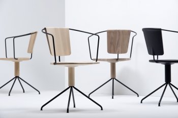
The Bouroullec Brothers designed these awesome chairs. I don't know if they spin or not, and I really want to find out. Initial look at them doesn't suggest they would, but you never know, there might be some sneaky ball bearings tucked away in that bottom wooden shaft. The rods would definitely have been CNC bent, as the accuracy on those would have been fairly difficult to get right otherwise. CNC rod bending is definitely a process that I think I'd like to use, as it doesn't seem to be too expensive or time-consuming as a CNC process, plus the yielded results can be stunning. There are a few other pieces of furniture that I really like that utilise a similar process.
Image acquired from: http://www.designboom.com/

These stools are stunning. When I first saw them on DesignBoom, I think I fell in love a little bit. The stool just has such a beautiful synergy between the materials, as well as between the colours. The black just works so nicely with the colour and innate texture of the timber.The key part of the design is of course the wire form that snakes between the legs of the stool, creating a variety of different leg heights, depending on how you rotate the stool. I think the notion of creating an asymmetrical design is a very clever one, and really explores the way we express a particular use through the forms we use.

Thursday, July 17, 2014

INDN 312: Brand Research: Apple, POC, Dyson, Muji

To think about how the scenarios that we're going to develop, one of the considerations that I need to take into account is the different companies mentioned in the brief, and how they actually convey their brand's identities and the way they present their products. One of the important aspects of a brand in today's market is the ability to cultivate a certain culture around themselves as well as generate a certain image that can be conjured at any time by a consumer looking at their brand.

The four companies that I'm tasked with taking a closer look at are POC (A Swedish adventure wear company), Apple (An American multinational consumer electronics company), Dyson (A British household electronics company), and Muji (A Japanese household and consumer goods company).

POC

Image acquired from: http://www.pocsports.com/

POC is a Swedish corporation that designs adventure and sporting wear for a variety of activities. As well as making beautiful and well designed gear, they also push the limits in terms of material usage as well as material research. The brand has been endorsed by a large number of athletes, and as such prides itself and bases it's image on being at the forefront of adventure wear design and technology. The technological advances are mostly in material research as well as fittings and comfort, and while most of the gear POC develops in terms of types is fairly standard, there are a good deal of products that are very unique and serve purposes and needs beyond that of the average adventure sports person.

POC's aesthetic is texture and pattern low, relying instead on block colours and large sections of colour to drive the unifying design aesthetic. Since the company is responsible for developing clothing, a very standard way of displaying one's personality, the company sells products in a very large range of colours. The one-size-fits all mantra cannot be found, although anything that you buy would very definitively be "designed by POC". The brand's logo is to be found on everything, and it certainly isn't always discreet. The brand uses a futuristic sort of style to it's products, and this style works well to underpin the brand's value set.
-----

Apple

Image acquired from: https://www.apple.com/ipad/

Apple is a very familiar company for any industrial design student, as go to any lecture and you'll be guaranteed to see an Apple MacBook out on someone's table. Apple's consumer electronics division is huge. They have received a host of both negative and positive critiques for their design styles as well as their design choices. Advertising is a huge aspect of what makes Apple Apple. Employing a vast array of emotionally manipulative techniques in it's advertising and PR, Apple has firmly cemented it's position as the brand of designer electronic devices to own.

Utilising excellently minimal design choices for the majority of their products, the Apple brand is something that isn't conveyed through logos, but through an extremely distinctive look. Their current primary choice for materials is brushed aluminium and polished glass, with several other materials coming in in certain situations and products as backups. Apple's brand has been so aggressively marketed that certain products of theirs are now synonymous with that type of product. An iPod is now synonymous with an mp3 player. Apple makes a lot of highly considered material choices, as well as aggressive development into efficient material usage and electronic consideration.
-----

Dyson

Image acquired from: http://www.dyson.co.uk/vacuum-cleaners.aspx

Dyson is a brand that manufactures and designs vacuum cleaners, hand dryers, blade-less fans, and heaters. The company prides itself extensively on it's founding, whereby James Dyson developed the original Dyson bag-less vacuum cleaner after extensive iteration into a workable product. The company uses this story as a basis for their design identity, but primarily the company looks at creating products that work in different or better ways than their competitors or predecessors.

Dyson has created an identity that presents their products as the ultimate expressions of their development. With the company being primarily an engineering company, the design of the unique vacuums have presented a very interesting design challenge to the company. While other household electronics designers attempt to hide the products and the way they work, Dyson seeks to exemplify and highlight the mechanics and functionality of their products, by using both strong colours and interesting forms.
-----

Muji

Image acquired from: http://www.muji.eu/pages/online.asp?Sec=19

Muji is a Japanese company that expresses it's identity by being a brand that has no distinguishing brand. The goods it sells are designed to be quality goods without being excessively branded or extremely distinctively designed. The products are designs with a minimalistic style in mind, as well as encouraging recycling and avoiding waste in product manufacturing and packaging. This no-brand attitude is a very interesting one, as it immediately seeks to position Muji as a brand that is just great as well as being reasonably priced without being dominated by a particular identity or logo.

Muji is in a way also a blanket brand that occupies multiple different types of products. The distinction that separates it from other brands is merely in terms of the products being well designed, and yet this lack of distinction is a key importance for making sure that people feel they can buy everything Muji without everything looking identical. In that regard, I find the concept similar to Ikea. There is a unifying aesthetic, but it doesn't overtone everything else.
-----

INDN 312: Brand & Identity


The project that we're presented with in this new course is to look at using new technologies to add value and to promote NZ resources, in the global marketplace. This has the potential to sound a little bit wishy-washy, but I think that it holds significant interest, and the technologies that we might get to use sound exceedingly interesting. The way the project is structured is that it is laid out in two ways, allowing for two different paths a student can take to develop a project.

The nature of the project is very much up to us, but we have to involve the respective technology of one of the different branches we get to pursue. The two different scenarios we get to choose from involve two different types of technologies, each amazing and very interesting in their own right.

bioplastics
Image acquired from: http://www.scionresearch.com/impact/wood-fibre/investment-in-bioplastics-pays-off

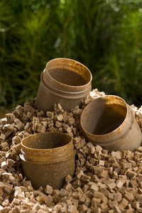
The first technology or set of technologies is a large mass of research being done by Scion, a biomaterials research facility that is making really interesting forays into the area of wood-fibre enhanced plastics, allowing for them to be strengthened as well as having some really interesting properties. The interest factor fer me behind this set of possibilities is what might be possible with them. Apparently Scion has figured out how to extrude the materials into some really interesting shapes, as well as 3D-printing filament, which is one of the things that possibly at this point has the most potential for me.

Stretch sensor mounted to a hand and used to capture motion.
Image acquired from: http://stretchsense.com/


The second technology that we'll be hearing more about tomorrow is called StretchSense, a wireless stretchable sensor setup that can work via Bluetooth with mobile phones and computers, and has a still-not-entirely-known potential uses. Supposedly the sensors are able to tell how much they have been stretched, allowing for measuring the human body, as well as small-scale robotics and other projects.

Both sets of technologies have lots of potential, and both I can see interesting and innovative uses for, however, this project is quite specific in the way that it allows us to approach it, as it calls for us to investigate and develop our projects with New Zealand and the NZ identity specifically in mind. The result of this is that depending on which scenario I choose to pursue, I have to seek to add value and promote NZ resources through either looking at NZ culture or NZ commodities.

Image acquired from: http://www.mch.govt.nz/

Looking at NZ culture I have to consider how my project might apply to the present NZ fashion trends, or perhaps how it might relate to our identity as an arts-and-craftsy nation. It could also look at the intertwining of many cultures, considering how the project might appropriate all of these cultures or develop their ties. New Zealand has a certain identity when it comes to our lifestyle, and this could also be something that the Scion research applies to, as well as considering how research like that might fit in around this 100% green (total bullshit) national identity we've built around ourselves.

Image acquired from: http://static2.stuff.co.nz/

The NZ commodities angle looks at how NZ is defined by the commodities that we produce. Certain materials and goods shape our national identity, and allow us to have a distinctive individuality. A lot of materials and commodities have a certain cultural and historical heritage, such as flax (Maori culture) and wool (European culture). These materials, when used appropriately, can be distinctly New Zealand. The exports that drive our economy identify us in the global marketplace, while the distinctive material identify us through slightly more cultural means.

Wednesday, May 21, 2014

INDN 341: Inspirations

When researching precedents, we arrived at several different works that helped shape our final form. We had already arrived on our idea for the project through group discussion, and used these in part to influence how we wanted the project to look and perform.


"Melted Captain" - Valerie Hegarty, 2011

Valerie Hegarty uses a melting aesthetic in the majority of her works, and we wanted to emulate this in some respect. By applying water to either PVA paper we made ourselves, or thin paper such as rice paper, we will be able to achieve the desired effect. We really like this quality, as it adds a mystical aspect to the disappearing paper.

"Ribbon Snake" - Len Lye, c. 1965

The mechanical aesthetic of this Len Lye piece was a large inspiration for the wall mounted conveyor belt design. The kinetic aspect was also a factor in our design process, as we knew we wanted the project to move in some regard, and this rubbery, bouncy sculpture was very similar to what we imagined the project to be like, and reaffirmed our initial designs.

"Rotozaza II" - Jean Tinguely, 1967

This sculpture was the perfect example we were looking for in terms of the destruction aspect we were after. It performs almost exactly how we want the conveyor belt of destruction to work, and is also quite similar in aesthetic to our initial sketches.

Sunday, May 11, 2014

MDDN 314: Concepts & New Blood

So, the new project that I'm working on is a projection-based project. The idea is that we construct a "space" on which we project something. The projection should complement or express the physicality of the projection surface, or it could play with what the projection surface is made of.

I decided to very much express what the projection surface is made of. The other day, I was playing around with fabric in front of the window, and noticed that the light coming through from the sun was making the fabric glow in a really interesting way. Thinking ahead to projecting, I then decided that the projector could do an even better job at this than the sun, because of the dynamic nature and potential of projectors.

After considering the potential of the fabric, I decided what could make it even better would be to make the form of the fabric much more expressive. Rather than make it a dynamic entity which could be re-shaped and toyed with at will, I want to make it look very dynamic, as if it had been frozen in time, but actually make the form itself very static. The reason for this is that then the digital aspect of the projection can make the form seem far more fluid and dynamic than it really is.

I really want to harmonise the digital/analogue connection in this piece. Rather than making it all one or all the other, creating a unique harmonisation where rather than the normal analogue impacting the digital (buttons, knobs, dials, movement), I want to invert that concept. The best, most interactive way to present the digital was, in my mind, to have the projector projecting upwards as if onto the underside of a table. In stead of a table however, I propose to have a stiffened and formed piece of fabric. Above is the way I had to sit to projector to get it to do what I wanted!

This was the result. I was astounded by the effect it produced. The fabric glowed with a fairly high intensity, but not so bright as to blind. It actually felt extremely ethereal in the middle of my dark room, and had a "magic treasure chest" feel to it. It felt like something that was almost psycho-religious in a way.

To project onto the fabric, I wrote up a piece of processing code that made a whole bunch of triangles with shared vertices. I then had the shared vertices move around at different rates, creating an undulating triangular grid of different colours. If I had had more time, I would have tried to map some of the shared vertices to the "peaks" and "ridges" that I created in the fabric landscape.

Thursday, April 10, 2014

INDN 311: Fashions Of The Time

After working hard on the form of my designs, I decided to take a step back again and take a look at some good ol' fashioned inspiration, as I really don't do that enough. The way I've always perceived inspiration is perhaps a little false. Recently I've begun to perceive it in the "right" way (if there is such a thing). I look at as something to get me psyched out for design, as something to inspire me, as a way of figuring out what designs have been timeless, and what designs have been a bit less so. By working "with" different famous designers, I let their sentiments on forms sculpt my work. And to be honest, it's almost always worked out for the better.

Image acquired from: www.mocoloco.com

This skylight light designed by Denise Hachinger has such a cool style. By controlling the direction of the light very specifically, she's been able to make a light that shows the pinpoints of light as almost floating in space. With heavy references to the natural world outside our own, she's create a very successful, unique image for her work.

Image acquired from: www.stgw.net

Braun has always had a style that's been very close to my heart. I love Dieter Rams' style that he's created. We studied some of his work in first year, and giving myself to opportunity to go back to my roots a bit and get some understanding of what he was all about was really good for me. I enjoyed the opportunity to re-read over his 10 Principles of Design and see how I could apply them to this product that will hopefully get my name out there!

Good Design Is Innovative : The possibilities for innovation are not, by any means, exhausted. Technological development is always offering new opportunities for innovative design. But innovative design always develops in tandem with innovative technology, and can never be an end in itself.

Good Design Makes a Product Useful : A product is bought to be used. It has to satisfy certain criteria, not only functional but also psychological and aesthetic. Good design emphasizes the usefulness of a product while disregarding anything that could possibly detract from it.

Good Design Is Aesthetic : The aesthetic quality of a product is integral to its usefulness because products are used every day and have an effect on people and their well-being. Only well-executed objects can be beautiful.

Good Design Makes A Product Understandable : It clarifies the product’s structure. Better still, it can make the product clearly express its function by making use of the user’s intuition. At best, it is self-explanatory.

Good Design Is Unobtrusive : Products fulfilling a purpose are like tools. They are neither decorative objects nor works of art. Their design should therefore be both neutral and restrained, to leave room for the user’s self-expression.

Good Design Is Honest : It does not make a product more innovative, powerful or valuable than it really is. It does not attempt to manipulate the consumer with promises that cannot be kept

Good Design Is Long-lasting : It avoids being fashionable and therefore never appears antiquated. Unlike fashionable design, it lasts many years – even in today’s throwaway society.

Good Design Is Thorough Down to the Last Detail : Nothing must be arbitrary or left to chance. Care and accuracy in the design process show respect towards the consumer.

Good Design Is Environmentally Friendly : Design makes an important contribution to the preservation of the environment. It conserves resources and minimises physical and visual pollution throughout the lifecycle of the product.

Good Design Is as Little Design as Possible : Less, but better – because it concentrates on the essential aspects, and the products are not burdened with non-essentials. Back to purity, back to simplicity.

These should be my "tenets" of sorts. I should have these up on my wall at all times! Really, I should.

Sunday, April 6, 2014

MDDN 314: Situational Sounds

In order to assemble the soundscape that I want, I needed to first decide on what it would be. The brief was fairly open, allowing for a fair bit of playing around in terms of what we wanted to do. The first thing that I decided was that I wanted to do something a bit different. I wanted to take this project somewhere where you can't go in real life. I wanted to create a space for the future. One space that I've enjoyed on the odd occasion in Wellington has been the railway station, so I decided to do a futuristic railway station. 

Erm. Excuse my French, I actually mean The HyperTrain Transit Station. Much better. This station will feature a range of things, as I decided one late afternoon that I really needed to plan out everything I wanted in my soundscape. This involved actually thinking of all the layers of sound that exist in a futuristic train station. And when you start thinking about all the sounds involved, that number gets pretty large.

After writing that list and figuring out which sounds I would need to make personally and which sounds I could record, I took a trip over to the train station, and did some field recordings there. All of the sounds that I got there will make up the bulk of the "background ambience" of the HTTS. Once I returned, I got into making my own sounds. This proved to be a lot of fun, and I really enjoyed just playing around with the effects and with the way I could create different noises.


One of the first elements I gave work was the advertisements. I see the future as being very invasive in the way that ads get used. This is evidenced in all sorts of movies, such as Blade Runner and The Minority Report. I wanted to recreate this feeling of the advertisements being everywhere.

Advertisements regarding off-world expansion seemed to be a must have, as well as to create an obligatory Blade Runner reference.

One aspect of the world that I wanted to create was this notion of Synthetics (androids) being seen in a bad light. One of the ads that I made references the idea that Synthetics were developed to be slaves, but developed true sentience and could no longer be slaves.

Creating futuristic car noises was so much fun. I really enjoyed the creation of an endless volley of different-but-similar sounds. That, and it's just really fun to say Niiiiiiiaaaaaaaooooooooommmmm.

This is a noise that I generated and manipulated heavily in Audacity. Originally generated as noise, I then overlaid several frequencies onto it, to give it a metallic vent drone, as if it were the sound of a train idling or an air conditioning unit.

Tuesday, March 25, 2014

INDN 341: Researching Fabrication (In the loosest sense)

So to start things off in a big way, I think I'll look for some real inspiration and get some ideas from that. 3D printing is fantastic technology. People from 50 years ago would look at what we have now and see endless opportunity. And we have that technology at our fingertips. It's a great time to be alive and a great time to be creative. It's a great time to be a designer.


This is a 3D print of Joy Division’s Unknown Pleasures album artwork, a particularly influential piece of graphic design by Peter Saville. The thing that I love about the 3D print is the way that the design feels quite abstract, as well as being based on something, that while measurable, is not something that we can actually visualise ourself, namely a pulsar signal. This is pretty stock standard 3D printing, but I like what the form represents. It represents a famous piece of history, it represents something powerfully creative and inspiring. This is what I want to create with my system, something that allows people to feel inspired and driven by what they are creating.


Created by Chilean Studio gt2P, this "Catenary Pottery Printer" prints by allowing plaster to be poured onto fabric which is arranged in a particular way to allow the plastered fabric to retain particular forms. By allowing the water to seep through the fabric, the fabric ultimately retains the plaster and turns into a hard, waterproof form that is then cut out of the fabric piece.


By doing this, it allows creation of parametric forms without the use of a computer, allowing for the creation of infinitely interesting items, as well as nigh unlimited numbers of different abstract forms. This "printer is fantastic, as rather than being some sort of computer controlled device, the output is so terribly human, so completely hand-designed, that that the computer element that could have been there to generate the parametric forms is completely lost amongst the design. And that's great.


The way that this vase was made is pretty complicated, and I won't get into it, but if you want to know more, you can check it out over at Design Milk. I'm a big fan of the form that this takes, as it is something that really represents an abstract, possibly useless take on an age-old classic. I think I want to create an interesting take on that same concept. Except, rather than re-shaping the form of a classic design, I want to re-shape the way a classic process takes place. Rather than doing the process through traditional means, what if the process was controlled by a user-input driven, very inorganic device, that however defiled the user's input, yet relished the semi- chaotic randomness that resulted from that destruction of normal process.


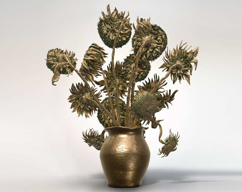
A 3D take on an originally 2D masterpiece is an interesting route for 3D printing to take, and yet it represents a step that I want to take in the opposite direction. I want to take something that is inherently 3D and direct it towards the creation of something that is 2D. Is this 3D print of the famous Van Gogh painting, the designer had to create extra features that would not have been visible before, whereas I want to potentially be able to condense multiple layers of 3D "data" into the creation of something that destroys or layers these elements in a unique way. In a way, I can see myself creating/designing something that flattens or realigns 3D data in a strange/chaotic way.

As you can probably tell, I've got some ideas, they just haven't totally come to fruition yet, so I'm going to do some sketches and make them more clear, for both you, the readers, and more importantly, myself.

INDN 341: Ideation For Fabrication Systems

The new project that we're tasked with has a different sort of dimension to anything prior. Never before have we had to consider designing something that makes other things. This is going to be a project that somehow expresses some form of digital fabrication. It's a bit of a terrifying prospect, and I'm not entirely sure how we're all going to handle it. That said, I have a lot of confidence in my year group, as they are all totally awesome and I love the work that they do.

The way that I interpret the project is in the form of something that will allow you to create something else. For this, I have several things in mind. The brief suggest we look at our hobbies and passions, and then extrapolate those into something that will allow a user to engage with it in a way that results in something tangible.

I like making beautiful things. I really enjoy the way that something looks when it's completed, but I actually really enjoy the way that things look when they are part way through their process. That raw, unrefined look has something very magical to it. The way that things feel, the way things still have all their rough edges, the way that a painting looks when you can't always quite tell how it's going to look when it turns out, or the way that mistakes waiting to be corrected can still be seen.

I want to incorporate this into a form that allows these mistakes to be a feature. I want to make the form allow for mistakes to be made and these mistakes celebrated as part of the beauty of the resultant creation.

Saturday, March 15, 2014

INDN 341: Production Phase & Idea Re-Focus

I went to class this past week with a fair amount of trepidation, as I had a few doubts regarding the fact that I'd decided to just combine the PVA with fabric. I was worried that the material I had created wouldn't be interesting enough to generate the attention I wanted the project to garner. So, I talked to my tutors, and the general consensus was that I might not be pushing the brief enough to get a good response.

An idea that was suggested was that I should keep with the same concept, but alter it slightly. The way that I proposed to alter it was to utilise carded wool and combine it with the PVA to create a custom material that would retain the properties of both while having significant new properties.

The white carded wool was beautiful and soft, and provided such a lovely texture. The way it's been carded is something I can't say I'm terribly familiar with, but it's very, very cool how the fibres of the wool have been carded together to form a more cohesive bond, in a usable form. It's incredibly cool, and the fibres come apart in such an interesting way.

Combining it with the PVA has been a pretty grotty experience, as working with wool when it is wet isn't a pleasant experience, and adding the PVA to it only made it slimy and rather disgusting. But it was still a fun thing to play with, and working with these materials proved to require a lot of experimentation.

So, to start building on the lamp base component, I headed to the workshop. The basic idea was to connect the separate components with small rods that then cross the void between the parts, where the wool would fill the space.

By cutting the different segments all out of the same continuous block, I should hopefully be able to ensure that the entire piece looks really good when it's been put back together. I chose to use a beautiful piece of ash for it, which was left over from the steam bending project I did with my group.

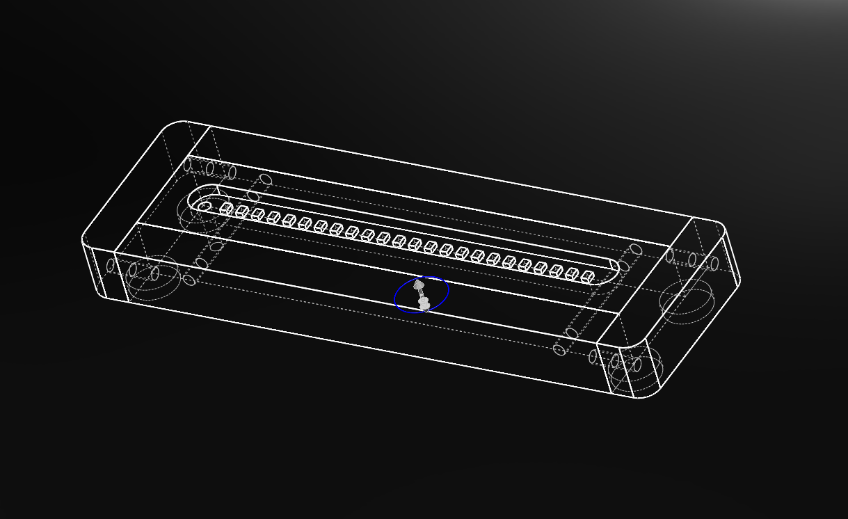
To make a space for the LEDs, I routed out a channel in the top of the central block, so that they would be nicely recessed. Keeping them recessed allows the top wool to not intrude on the light, making it nice and easy to manipulate the wool without worry of letting the form catch on the lights.

Monday, March 10, 2014

MDDN 314: First Soundwalk Attempt

So, to get a feel for doing a soundwalk, I tried to plot out one today along one of my favourite walking routes. This was just to get into the mindset of really listening to the environment. This proved to be a little more challenging that I initially supposed. It's not the easiest thing disregarding your other senses...well, disregarding them is probably a bit of an overstatement, but you get my point.

The route I traversed today with starting points for the audio logs.

Point #1: St Peters Cathedral
Starting off in a very interesting space aurally was a bit of a boon, as it provided a good dynamic for then stepping outside. One of the most interesting things about stepping into the church is the floor. The floor has obviously got some solid wooden boards in it, but gives way to vacant space below as there is a very satisfying *clomp clomp* noise when you walk. The other obvious thing is that churches and cathedrals have amazing acoustics, and with it being in the middle of a Sunday service, there was amazing choral music coming from within.

 
After the church, I left and turned right down Willis St, paying close attention to the sounds of the street as well as the sounds coming from the two other churches on the route.


Point #2: The Hangar
Coming around the corner onto Dixon St, there's a coffee place a little bit down the street. One of the best parts of this particular section was the way the sound from the cafe got louder as you got closer.

The sounds of the cafe almost take over your ears as if you were stepping into a bubble. It's actually quite surreal and sounds really cool on the recording. That was the aspect of that section of the soundwalk that I enjoyed a lot. Being able to pick out little sections in the sound "waves" of the cafe was a really big part of this soundwalk section.


The way the different sections of sound change in volume and alter in dominance is quite amazing. I love the way the mind chooses what is relevant as well as the actual physical sounds playing off against each other.


Point #3: Dixon St Crossing
This section I chose because the sound of the rustling leaves in the wind is quite a nice feature, since it really highlights the fact that there are always little green spaces in the middle of the Wellington CBD, even if it's still a city.


The way the sounds of the traffic come in waves as it passes by provides a dynamic backdrop to the soundscape.

Point #4: Alleyway Behind The Met Shop
This is another favourite little nook of mine. Situated behind the Met Shop and a Korean restaurant, it provides another little bubble from the city noise. The effect the semi-enclosed space has on the sound quality is really cool. It's surprisingly quiet as well as distorted.

One of the features of the space is the sound of one of the kind of broken vent fans. It sounds clunky and in need of a good oil or replacement. Occasionally you can hear the sound of a siren really well in the space, and sometimes if you're very lucky, you can hear some seagulls, serving as a gentle reminder of how close you are to the sea.


The space itself will however always provide an industrial feel to it, with the way the sounds echo reminiscent of a concrete jungle.


Point #5: Cuba St
Cuba St is where the life of the city is. People talking, children screaming, many many feet and a busking musician. The life of the city can be felt here. The sounds of the cars are but a distant hum as the voices of many fill the space around you.

The way the sound echoes gives you a sense of how well used and populated the space is. At night, the story changes completely, as the gentle hubbub of the city gives way to more individual, pin-pointable noises and voices.


Passing by the different shops provides a constantly changing stream of sounds. Whispers of different songs and the sounds of cash registers and clothes rails fill the motive space.


Point #6: Towards Michael Fowler
The older, more historical buildings here change the way the sound works, and the distinctly smaller number of people fills the sound space in a smaller way. The loss of control of the space to auto mobiles allows them to take over the sound scape with occasional singular waves of grey noise.


Passing by more coffee stores, the sounds of the coffee grinders running and the used coffee being knocked out provides a respite from the softer sound of the quiet ends of Cuba St.


Point #7: Route Into Civic Square
One of Civic Square's entrances is a small gap between the glass walls of the Michael Fowler Centre and the Town Hall's concrete shell. This space opens up quickly, but at the smallest point it is quite narrow. This divides the two sound worlds rather beautifully.

On the one side, you have the sound of the vehicles quite prominently, and then when you step through, they are overtaken by the distant roar of the six-lane Jervois Quay filtering over the walls of the square. The space feels huge, and the sound emulates this. Voices can be heard all around as people flow to and from the wharf and the city.


However, the space still feels quiet. It's a place of solace in the realm of the concrete jungle. The wind still whistles through occasionally, but that is but a small worry.


Point #8: Under The Wooden Bridge
Travelling down the stairs alongside the overpass/bridge, one feels this is the road less travelled by pedestrians. The wind picks up, and the lack of crossings make traversing the road troublesome.

That said, the sound of the cars is amplified and distorted by the concrete ceiling the bridge provides. The reverberation of the sounds could almost be mistaken for the ocean at times.


A lack of human noise makes the space feel a little barren, yet safe at the same time.


Point #9: The Wharf
Once again, the people hum takes over again. Coming out under the bridge and jumping onto the wooden wharf structure, the whole audio scene opens up. The sound of the people is directed towards you by the huge curvature of the space.

On this particular day, there was a competition on, and everyone was cheering. The sound of the microphones begins to pervade the air. Are we at the racetrack? It feels like that could be the case. The white noise of the water fountains flows and ebbs as you walk past it.


The sound of many footfalls on the wooden bridge slats as you cross it provides a steady, irregular rhythm, and allows the sound of voices to dull a bit.


Point #10: Te Papa Museum
Moving along the wharf towards the museum, the amount of people decreases. They are all watching the competition. Excited children yell about the pretty things in the container pop-up shops.

Passing the Te Papa logo, I tap on the different parts of it, and the result is very oddly musical. The metal, musical sound feels out of place among the ambient, white noise.


As you enter the museum, the sliding doors squeak as they open. People's feet shuffle as they move across the textured carpet entrance. The audio space closes up, and it's again obvious you've entered an indoor space, yet one that feels impossibly large.


Point #11: Wharf Farmer's Market
The rustle of the plastic bags as you enter the market is a big feature. People stuffing the bags and their baskets with all manner of food and other things changes the backdrop again. Music is everywhere. Buskers are left and right, and the loudest music gets your attention.
A big band with a dancing rhythm catches your ear. The trumpets call out over the noise of the crowds. The sizzles of many cooking stoves give the sounds more depth. Leaving the edge of the market, the individual conversations of the masses that move with you become more apparent.


You wonder what they are talking about, and why their bags are rustling still. Did they not find all they needed to in the market?

Friday, March 7, 2014

MDDN 314: What Is A Soundwalk?

I've started a new course at university called Audio-Visual Space, and the first project we have to accomplish involves creating what's known as a soundwalk. This soundwalk is a rather unique concept to me. I've always considered myself to be a very sense-driven person. I love experiencing the sounds, textures, sights and odours that the city has to offer. Wellington is quite a good city for this as it has a variety of all of these things. I enjoy sensing the city in this way.

The soundwalk is meant to be an experiential journey through a space or series of spaces, with a large emphasis on the sound of the spaces. The victim is instructed to pay close attention to the sounds in the spaces, or the lack thereof. The spaces vary from indoors to outdoors, from populated to barren, and the user is encouraged to explore and isolate the various layers of sound with their mind.


SOUNDWALK from Andrés salas on Vimeo.

Andrés Salas has a very interesting, informative video on the subject, part of which we watched in class. I really enjoyed the use of video in combination with strange and ambient sounds to drive his point. Super cool! We have to design our own soundwalk for this first project, which should be quite interesting to do and experiment with.

Thursday, March 6, 2014

INDN 311: First Impressions

INDN 311 is the God paper for the first trimester of third year. We're allowed free roam, and encouraged to design and make something that will get our work on several prestigious design blogs. Essentially, it's a class where we get to focus on and make one cool project and get famous. That's the plan at least. On the other hand, the prospect of focussing one whole trimester into a single project is also equally scary. It's scary the concept of our entire course riding on that one project.

The brief for the project basically entails that the project should be something electronic that incorporates 3D printing into it. It's such a broad scope that I'm afraid I'll get lost in it. But, I think that as long as I stay focussed and play to my strengths, I should be okay. I need to however also make sure that I don't do a project that's too safe. I need to get into the habit of thinking outside the box a little bit more. I don't do that enough.


This design is incredible cool and utilises already rather well understood technology, which I really love. The notion of bringing the outside world into a space that might not get to experience the outside world much is an awesome concept. Iskandar states that bringing some elements in from outside in the form of light, sound and motion decrease stress levels and make a person feel more at ease with their work.


This project is another very clever one. By manipulating where the phone sits on the speaker system, the user controls whether the phone plays, stops or switches to the radio. It's an incredibly funky, minimal design that I really love. The thought of bringing the physical into something that nowadays has become so digital is a really nice touch that Victor made.


These puppies are awesome. Apparently they don't work so well for lower bass notes, but for higher-range sounds, they work a charm. According to MocoLoco, their is an option to join a subscription to a live stream of ambient noise from speakers posted up in the mountains of Takayama and Morotsuka in Japan. So if you wanted to, you could bring the sounds of birds and wildlife into your home. I like these a lot, especially how it's not immediately clear what they are, as well as for bringing the outside into somewhere that isn't outside.


The good night lamp is another really awesome use of internet connectivity. The concept is that when the big house is turned on or off, the matching small lamp anywhere else in the world (provided it is linked to the internet) mimics it. I really enjoyed seeing the ideas that the creators had for it's use, and it's a really clever way of communicating with people anywhere non-verbally.

This course is going to definitely be very challenging, but I think also has the potential to be the most rewarding!

Tuesday, September 24, 2013

MDDN 242: Finding Likeness & Extrapolating

So, I think I've got my plan for where to progress with the next project. I want to take it in the direction of connective tissue or data visualisation. I really want to have the skill to be able to make this project actually visualise some form of data, but I think I'm going to have to end up leaving that part out of it all.

Image acquired from: http://www.digicult.it

I really like this form of visualization, as it ends up looking like a mind map on steroids. I think that the most interesting part isn't necessarily the way that the data is visualized, but the patterns and forms and textures that evolve out of the myriad of connections made. This is what I want too expand on. I think that making connections like these ends up looking like constellations, but that I can sculpt this mess into something else as well.

The form that I decided I would make started with an idea from my precedents. I wanted to make extreme natural formations that would challenge people's eyes and create something familiar while displaying it in a foreign way. I think this has a lot of potential to be a very interesting visual stimulus.

As you can see here, the web-like structures layer up and create focal points, where the layering gives us a sense of depth and shading. I think I will try and redo this sketch with the web being a different shade. Perhaps as the web layered up, the form could shift in colour?