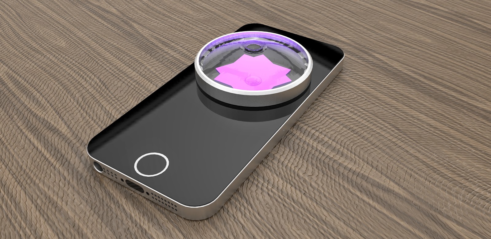
The project that I've been working on has finally come to a close, and the components are finally finished. The result I've gotten is one I'm reasonably proud of, but I think the video might need a bit more work before I try and get the work I've done onto an international blog. Getting work onto the blogs can be a bit of hard work, as I've found in the past. Generally having a good idea can get you places on the merit of the idea alone, but often it comes down to your execution just as much. Pull off a good idea crappily, and it might as well not exist. That said, beautiful execution isn't everything either. I think I might revamp my video a bit and focus on the sleep-cycle aspect of the project a bit more, as that is what my lecturer had to say on my work. But all in all, it's not too bad! I'm fairly pleased with it all!
Showing posts with label INDN 311. Show all posts
Tuesday, June 17, 2014
INDN 311: Ambivisualisation.
Labels:
Hand-in,
INDN 311,
Third Year
Saturday, May 31, 2014
INDN 311: Glass Lensing
To create the new lens, I looked online first. I know that lenses are exceedingly hard to make unless you have an extensive set of tools and expertise. I was tempted to use the skills available to me through the glass blower again, but I thought that that might end up being too expensive (especially since I had already spent a fair amount on the project thus far).
An initial idea that I settled on was to use a convex lens, since this would seek to magnify the output of light, most likely flipping the orientation of the image before it reached the ceiling. Thus, I decided to scrap the notion of having it project a more defined image onto the ceiling. Now I just want to make the phone abstractly project colour washes and slight movement onto the ceiling, in order to create ambient "mood" lighting.
I found this concave lens on the internet for very little money. The reason I'm not looking at convex lenses is so that I can actually disperse the light from the screen further. The resultant effect I want to achieve involves not focussing the light, ergo why I decided a concave lens would work better. The spread of the light would enable the iPhone to provide a larger coverage area.
To minimise vibrations from the phone transmitting to the table in the form of noise, the user can place down the wool mat, intended to provide juxtaposition with the pure and clean form of the phone and lens. I actually went back and re-cut the wool mat, as the first version of it just wasn't the best size. It was a little bit too minimal and not particularly generous.
One of the problems with laser cutting the wool is that it ends up stinking, due to the burnt wool and the burnt oils that are present in wool. And I mean you can't go within two meters of the darn thing without getting a bad stench from it. To resolve this I've used washing powder and then washed it by hand in a sink with cold water, in order to prevent shrinking. Interestingly it ended up stretching, but this pretty much ended up mostly being due to the fact that I was washing it in quite an aggressive way, squeezing and squashing the wool mat.
An initial idea that I settled on was to use a convex lens, since this would seek to magnify the output of light, most likely flipping the orientation of the image before it reached the ceiling. Thus, I decided to scrap the notion of having it project a more defined image onto the ceiling. Now I just want to make the phone abstractly project colour washes and slight movement onto the ceiling, in order to create ambient "mood" lighting.
I found this concave lens on the internet for very little money. The reason I'm not looking at convex lenses is so that I can actually disperse the light from the screen further. The resultant effect I want to achieve involves not focussing the light, ergo why I decided a concave lens would work better. The spread of the light would enable the iPhone to provide a larger coverage area.
To minimise vibrations from the phone transmitting to the table in the form of noise, the user can place down the wool mat, intended to provide juxtaposition with the pure and clean form of the phone and lens. I actually went back and re-cut the wool mat, as the first version of it just wasn't the best size. It was a little bit too minimal and not particularly generous.
One of the problems with laser cutting the wool is that it ends up stinking, due to the burnt wool and the burnt oils that are present in wool. And I mean you can't go within two meters of the darn thing without getting a bad stench from it. To resolve this I've used washing powder and then washed it by hand in a sink with cold water, in order to prevent shrinking. Interestingly it ended up stretching, but this pretty much ended up mostly being due to the fact that I was washing it in quite an aggressive way, squeezing and squashing the wool mat.
Labels:
INDN 311,
Process,
Third Year
Sunday, May 25, 2014
INDN 311: A Critical Re-Focus
One of the problems that came out of the interim presentations was that the lecturer didn't really like the design of the little bottle-lens I had made. The opinions flying around were that it was too thick and a bit unwieldy, and didn't really express the design of the phone as well. This is a sentiment that I can appreciate, as unfortunately the bottle did come back a fair bit thicker than I had originally designed. But oh well, even if I don't use it (which at this point I probably won't), it will still make a nice little ornament that I designed. Might even be able to give it away as a little present some day!
The first thing that I looked at was potentially isolating just the lens and then seeing if I could use just that piece of glass, as opposed to the pre-existing metal lens casing. Apparently removing the lens from it's casing requires a very specific tool. Another suggestion that came from the lecturer was that I should get the glass blower to make a small dip in the top of the middle of lens, in order to allow for the water to still be a component in the design. The rationale for this is that the water was what made the whole design special, and not just a lens on a phone. The vibrations of the phone could still vibrate the water too, and achieve a certain result.
In order to encase the lens and make it work with the phone, I decided that working with an aluminium frame on the lens would help unify the aesthetic between the lens and the phone. This also serves the purpose of raising the lens up from the phone, improving the lens' effectiveness. I have a feeling though that I can improve the lens' effectiveness as well as how it holds water even further. Stay tuned.
The first thing that I looked at was potentially isolating just the lens and then seeing if I could use just that piece of glass, as opposed to the pre-existing metal lens casing. Apparently removing the lens from it's casing requires a very specific tool. Another suggestion that came from the lecturer was that I should get the glass blower to make a small dip in the top of the middle of lens, in order to allow for the water to still be a component in the design. The rationale for this is that the water was what made the whole design special, and not just a lens on a phone. The vibrations of the phone could still vibrate the water too, and achieve a certain result.
In order to encase the lens and make it work with the phone, I decided that working with an aluminium frame on the lens would help unify the aesthetic between the lens and the phone. This also serves the purpose of raising the lens up from the phone, improving the lens' effectiveness. I have a feeling though that I can improve the lens' effectiveness as well as how it holds water even further. Stay tuned.
Labels:
INDN 311,
Process,
Third Year
Tuesday, May 20, 2014
INDN 311: Interim Hand-in
Labels:
Hand-in,
INDN 311,
Third Year
Monday, May 19, 2014
INDN 311: Coded Wool and Bottle d'Glass
Moving the code from the computer to the phone proved to be an easier task than I expected it to be, as I found an app that worked on iOS that was able to compile my processing code, albeit at a quarter of the iPhones potential screen resolution. That aspect was actually extremely frustrating, as I had to go back and edit my code to numb down the screen resolution and all the locations.
For showing how the code works on the phone, I recorded the code functioning on my computer with a particular song, and then ported both the song and the frames from the code into Premiere Pro. This I then exported in a format that would function on the iPhone's screen and operating system.
The code actually ends up looking a lot more sophisticated than it really is. (Not that I should be telling anyone about that, but oh well!) The white circle that travels around the edges is both an aesthetic element as well as an element that helps to place the bottle on the screen.
And hey presto, it's the glass bottle! I got this little guy back from the glass blower today, and it's really quite a beautiful piece. I must admit, it's a bit chunkier than I might have liked, but there's not really a whole lot I can do about that. I designed it thinner, but it being thick like this isn't the end of the world. I carved up the cork once I got the bottle back, making a little stopper that fit nicely.
As you can see, the glass bottle has some very interesting refractive qualities, and these transmit in an interesting way to the surrounding area. The transmission to the roof is very vague and ambient, which is the way I wanted it to be. There are also really interesting little refractive points that shatter off the glass onto the table surrounding the phone and wool.
One of my concerns is that the glass blower wasn't able to achieve the lensing in the bottom of the bottle that I designed. Apparently that would have made the glass too thick to shape and manipulate. The result is that the lens in the bottom is less concave than I would have liked it to be, meaning that the effect it has on the emitted light won't be as strong.
Labels:
INDN 311,
Process,
Third Year
Thursday, May 15, 2014
INDN 311: Added Components
After talking to my lecturer, we decided that I should also look at making a base for the phone to sit on, because the vibrations from the phone would make a buzzing noise on the table. Since I'm making the cork out of, well, cork...it seemed like a logical conclusion to also consider making the base out of the same stuff.
The cork would look nice, but another option that was discussed was the possibility of using a natural coloured piece of felt, to get the tri-material thing going on. A nice shade of felt, alongside glass and cork, would work rather nicely.
I've started assembling the cork for the bottle. Unfortunately the cork that I could get hold of was too thin to make cork, so I had to layer up a whole bunch of slices and glue them together. Once I have the glass bottle back from the glass blower, then I will be able to assemble the whole thing, as well as start shaping the cork stopper.
I got the wool felt from Made On Marion (an awesome arts & crafts store near Te Aro campus, definitely work a checking out if you're in the area!), and then I laser cut it. Laser cutting the wool was not fun, as since the wool is essentially oily hair, it absolutely stank when a high powered laser burnt it. Resultantly, to try and combat that, I have hand washed one of the circles that I made and am now in the process of letting it dry.
To cut the cork, I etched it with the laser first, to mark out my cutting lines, and then cut it with the scroll saw. This proved to be a bit easier than previously thought, and actually achieved some pretty good results. Of course the sides need a bit of sanding, but essentially the large circle shape is there. I decided to do both a wool circle and a felt circle to be able to look at which one looks and works the best.
The cork would look nice, but another option that was discussed was the possibility of using a natural coloured piece of felt, to get the tri-material thing going on. A nice shade of felt, alongside glass and cork, would work rather nicely.
I've started assembling the cork for the bottle. Unfortunately the cork that I could get hold of was too thin to make cork, so I had to layer up a whole bunch of slices and glue them together. Once I have the glass bottle back from the glass blower, then I will be able to assemble the whole thing, as well as start shaping the cork stopper.
I got the wool felt from Made On Marion (an awesome arts & crafts store near Te Aro campus, definitely work a checking out if you're in the area!), and then I laser cut it. Laser cutting the wool was not fun, as since the wool is essentially oily hair, it absolutely stank when a high powered laser burnt it. Resultantly, to try and combat that, I have hand washed one of the circles that I made and am now in the process of letting it dry.
To cut the cork, I etched it with the laser first, to mark out my cutting lines, and then cut it with the scroll saw. This proved to be a bit easier than previously thought, and actually achieved some pretty good results. Of course the sides need a bit of sanding, but essentially the large circle shape is there. I decided to do both a wool circle and a felt circle to be able to look at which one looks and works the best.
Labels:
INDN 311,
Process,
Third Year
Saturday, May 10, 2014
INDN 311: Bottle Form & Enclosure Elimination
After hustling and talking to my tutor about the project, we both decided that removing the exterior entirely was a much better option to pursue for this project. By removing the exterior, the workings between the digital device and the analogue lensing mechanism are laid bare, and the phone is allowed to highlight it's own beauty. Because, let's admit it, the iPhone is a very beautiful device.
Keeping the aesthetic though, I really want to expand on the concept of the designed bottle to make it something that both served as an extremely functional element, as well as being emblematic of the lens I was trying to make it. To make the bottle a diverging lens, I had to make sure that the bottom of the bottle was a one-sided concave lens. This would refract the light out when I sent the light from the phone through it, as well as "weakening" it, ensuring it wouldn't make the ceiling too bright.
I looked at various variations on the form, in particular the idea of faceting the form cylindrically. These sketches then formed the basis for my experimental forays into modelling the bottles in Solidworks.
The glass bottles all have different qualities and different benefits. The various iterations ultimately resulted in the bottle on the far right. This one I felt to be the best expression of the lens form that I wanted to achieve as well as the one that people would recognise. Usually a lens shape like that however would be a magnifying lens, but in this instance it's actually been manipulated to have the opposite effect. By having the concave lens in the bottom of the bottle and the top of the bottle just a thin constant thickness of glass, it should eliminate any focusing elements.
Keeping the aesthetic though, I really want to expand on the concept of the designed bottle to make it something that both served as an extremely functional element, as well as being emblematic of the lens I was trying to make it. To make the bottle a diverging lens, I had to make sure that the bottom of the bottle was a one-sided concave lens. This would refract the light out when I sent the light from the phone through it, as well as "weakening" it, ensuring it wouldn't make the ceiling too bright.
I looked at various variations on the form, in particular the idea of faceting the form cylindrically. These sketches then formed the basis for my experimental forays into modelling the bottles in Solidworks.
The glass bottles all have different qualities and different benefits. The various iterations ultimately resulted in the bottle on the far right. This one I felt to be the best expression of the lens form that I wanted to achieve as well as the one that people would recognise. Usually a lens shape like that however would be a magnifying lens, but in this instance it's actually been manipulated to have the opposite effect. By having the concave lens in the bottom of the bottle and the top of the bottle just a thin constant thickness of glass, it should eliminate any focusing elements.
This is an example of how said bottle might look on the screen of the phone. The lighting isn't exactly what the real lighting would look like, but it is as close as I could get it until my rendering skills improve.
I've gotten the bottle form off to the glassblower, and hopefully I will hear back from him soon as to how the project turned out.
Labels:
INDN 311,
Process,
Third Year
Sunday, May 4, 2014
INDN 311: Rendering And Modelling Bonanza
For the presentation of the form and function, I developed a 3D model of the last form I designed. It was actually much harder than I initially anticipated. I ended up having to split the design up into 4 parts, since the build space of the 3D printers that the university has was too small for it.
The full build would look something like this, ideally! The sizing is pretty much perfect, due to the precision of the 3D printers. Unfortunately I wasn't able to get it quite perfect, since the 3D prints suffered from curling a little bit. But oh well, not a whole lot I can really do about that. I just had to roll with it really.
Phone placement, with the colours showing through, shows how this is going to work. The glass on the top of that section will allow the light to refract through the glass and the vibrating water.
I also decided it would be a really good idea to break up the continuous block of wood, for two purposes. The first is to make the form more interesting as well as to create some contrast, while the second purpose of it is to make the device much easier to machine, as the wood is now split into separate parts. This makes it easier as I no longer have to create a perfect merge, since I would have had to machine the two halves separately anyway.
On Wednesday I'm going to talk to my tutor and get some feedback on the form, to get it to an optimised point whereby I can start the manufacturing process!
The full build would look something like this, ideally! The sizing is pretty much perfect, due to the precision of the 3D printers. Unfortunately I wasn't able to get it quite perfect, since the 3D prints suffered from curling a little bit. But oh well, not a whole lot I can really do about that. I just had to roll with it really.
Phone placement, with the colours showing through, shows how this is going to work. The glass on the top of that section will allow the light to refract through the glass and the vibrating water.
After printing this form, I then decided to push the form further. I think there's a fair amount of potential in the form, but it needed to be refined a bit more, to ensure that it spoke about the phone and the digital/analogue connection as much as possible.
After experimenting with different forms and sketches, I decided to play with the forms and see if I could 3D model them effectively to produce a nice result and get something I could connect with. I think overall that's the key to making this project a successful one. If I don't make the resultant design something that people will be able to understand and utilise, then it's going to fail.
The form on the far right is the latest design that I did for the presentation, and the form on the left is the newest form. I decided to tinker around with some of the sketches that I did. The beauty of CAD is that I can do this with such ease. Otherwise I'd have to visualise my form through some shitty sketches alone, but this is so much better.
I ended up deciding that the "folded" form was way too severe, and the simple beauty was kind of lost. I want to make the form express the beauty of the materials, while also highlighting the functional aspects of the design, such as the 70 degree angle for optimal iPhone angling that I've carried on through the design.
Resultantly, I decided it would be best to let the form be a lot more subtle and less brutal, while still letting the form be something interesting that could lead the eye around. I softened the shape and then removed the angle, making the form more feminine.
I also decided it would be a really good idea to break up the continuous block of wood, for two purposes. The first is to make the form more interesting as well as to create some contrast, while the second purpose of it is to make the device much easier to machine, as the wood is now split into separate parts. This makes it easier as I no longer have to create a perfect merge, since I would have had to machine the two halves separately anyway.
The vertical slot makes for a useful aspect of the device, allowing the device to have that dual functionality. The slot is a nice addition to the project that feels intentional and I melded heavily with the overall form. In the renders, I tinkered around a lot with the wood material, and applied both a bump and a specular map to the texture, in order to make the piece feel much more real.
On Wednesday I'm going to talk to my tutor and get some feedback on the form, to get it to an optimised point whereby I can start the manufacturing process!
Labels:
INDN 311,
Process,
Third Year
Wednesday, April 16, 2014
INDN 311: Final Looksy!
For the final presentation I also wanted to have some sweet renders to show, so alongside with the one from before, I also wanted to have a bit of coolness factor to go with my design process. Because people always love pretty stuff, right?
All of the renders experimented with the same structure and layout to the whole thing. Just manipulating the materials got me to thinking about what material I'd like to make the device from. Obviously, I have a certain affinity for beautiful timber, so there's always that to consider. I want to be able to make things that I love, and at the end of this day it's going to be something for me.
Other materials I should consider is things like extruded aluminium or plastic though, as well as a pure 3D printed material. That said, if I'm going to 3D print, then I'd want to make the design more expressive of that materiality, rather than doing the standard design and 3D printing, which would end up rather blocky.
After considering different options, I decided to do two different group renders, showing off the different materials I might consider. The wood on the far left would be something like a walnut or jarra, while the next along would be something akin to an oak or beech. Followed by a black, brown and white matte plastic.
Aaaaand of course I had to do some different shiny metal renders, for kicks. Till next time!
All of the renders experimented with the same structure and layout to the whole thing. Just manipulating the materials got me to thinking about what material I'd like to make the device from. Obviously, I have a certain affinity for beautiful timber, so there's always that to consider. I want to be able to make things that I love, and at the end of this day it's going to be something for me.
Other materials I should consider is things like extruded aluminium or plastic though, as well as a pure 3D printed material. That said, if I'm going to 3D print, then I'd want to make the design more expressive of that materiality, rather than doing the standard design and 3D printing, which would end up rather blocky.
After considering different options, I decided to do two different group renders, showing off the different materials I might consider. The wood on the far left would be something like a walnut or jarra, while the next along would be something akin to an oak or beech. Followed by a black, brown and white matte plastic.
Aaaaand of course I had to do some different shiny metal renders, for kicks. Till next time!
Labels:
INDN 311,
Process,
Third Year
Friday, April 11, 2014
INDN 311: Physical Processes, Techniques & Motorised Output
After exploring various shapes in my sketches, I decided to pursue a particular form in my modelling. For the presentation I plan on having two models, one that shows shape, size and fit. The second model will be a form that doesn't really represent the shape, but rather the function of the vibrating of the water.
This is the current state of the design. An oblong block that has a front slot for the phone, a central hole for the glass canister, and then a slot near the front end on the top for the device to be used as a stand for the phone. This part of the design is a part that I'll be 3D printing, just to show the shape and form.
To prove the concept of the water vibrations being something beautiful that can manipulate the light passing from the screen of the phone towards the ceiling. To do this, I constructed a small frame for holding a small vacuum formed piece of plastic that would hold the water. To this plastic form I then glued a small motor to the back. I then attached a small circular piece of acrylic that had the hole for the motors shaft slightly offset. By doing this, the motor will generate excess vibrations that will transfer through the plastic into the water, where the vibrations will become visible due to the nature of the medium.
I experimented with different sizes of attachment to the motor. By playing around with various sizes, I was able to get a variety of different ripple points. I eventually settled on the smallest ones, as I really didn't want water splashing everywhere and getting all over the presentations. The ripples that it generated were the ones above. I really like these because they weren't enough to actually get the water moving, just truly vibrating. It's really nice as you could really see these lovely standing waves that moved slowly over the water as the speed fluctuated a bit.
I added a bit of ink to the mix so as to make the ripples more visible. It kind of worked. For the presentation, I want to show this functioning to the point where it creates a visible difference to the transmitted light from below.
This is the current state of the design. An oblong block that has a front slot for the phone, a central hole for the glass canister, and then a slot near the front end on the top for the device to be used as a stand for the phone. This part of the design is a part that I'll be 3D printing, just to show the shape and form.
To prove the concept of the water vibrations being something beautiful that can manipulate the light passing from the screen of the phone towards the ceiling. To do this, I constructed a small frame for holding a small vacuum formed piece of plastic that would hold the water. To this plastic form I then glued a small motor to the back. I then attached a small circular piece of acrylic that had the hole for the motors shaft slightly offset. By doing this, the motor will generate excess vibrations that will transfer through the plastic into the water, where the vibrations will become visible due to the nature of the medium.
I experimented with different sizes of attachment to the motor. By playing around with various sizes, I was able to get a variety of different ripple points. I eventually settled on the smallest ones, as I really didn't want water splashing everywhere and getting all over the presentations. The ripples that it generated were the ones above. I really like these because they weren't enough to actually get the water moving, just truly vibrating. It's really nice as you could really see these lovely standing waves that moved slowly over the water as the speed fluctuated a bit.
I added a bit of ink to the mix so as to make the ripples more visible. It kind of worked. For the presentation, I want to show this functioning to the point where it creates a visible difference to the transmitted light from below.
Labels:
INDN 311,
Process,
Research,
Third Year
Thursday, April 10, 2014
INDN 311: Model That Final Form Now!
For this project, I want to create something unique, something that will be innovative and use pre-existing technology in an interesting way. I want to make something that makes an interesting use of materials, as well as being a really minimal design that really exemplifies the use of technology.
By positioning the iPhone inside the build, it serves the phone as both a safe location as well as a point for it to create it's light display. The doughnut shape of the glass receptacle on top I chose so that I could get an interesting medium (shape-wise) to play with for the light display. By limiting the light to that point as well as placing a void space in the middle for the light, it should also force the light from the phone to be more specific in terms of its final location. The cork in the middle of the form will allow the doughnut shape of the transmitted light to be more directed in it's shape.
This should allow me to have the app designed purely around this circular form, which makes for something really interesting in a design sense. I should be able to split the different parts of the circle up into segments and display different things and colours on them. By doing this, I could be able to generate various selections of colour and as a result, various different moods through colour combinations.
In terms of the look of the final object, I want to keep it really nice and simple. I love the look of a more subdued wood, such as oak or ash. I want to strike a balance between classy and everyman. Taking inspiration from firms such as Braun, I went with a design that was really clean. I also managed to achieve a dual functionality by building in a simple slot into the top of the design. This slot allows for the user to place their phone in a more upright position and use it as a normal stand during the daytime.
I want to make the central piece out of glass (get it blown with the guy up at the main campus). The choice of glass is to allow the vibrations to translate well into the water. By using a more rigid material, these subtle movements translate better. I'm tossing up making small holes at the four corners of the imagined square, but I think, keeping in Dieter Rams' lest design tenet "Good Design should be as little design as possible", I think I might omit them.
By positioning the iPhone inside the build, it serves the phone as both a safe location as well as a point for it to create it's light display. The doughnut shape of the glass receptacle on top I chose so that I could get an interesting medium (shape-wise) to play with for the light display. By limiting the light to that point as well as placing a void space in the middle for the light, it should also force the light from the phone to be more specific in terms of its final location. The cork in the middle of the form will allow the doughnut shape of the transmitted light to be more directed in it's shape.
This should allow me to have the app designed purely around this circular form, which makes for something really interesting in a design sense. I should be able to split the different parts of the circle up into segments and display different things and colours on them. By doing this, I could be able to generate various selections of colour and as a result, various different moods through colour combinations.
In terms of the look of the final object, I want to keep it really nice and simple. I love the look of a more subdued wood, such as oak or ash. I want to strike a balance between classy and everyman. Taking inspiration from firms such as Braun, I went with a design that was really clean. I also managed to achieve a dual functionality by building in a simple slot into the top of the design. This slot allows for the user to place their phone in a more upright position and use it as a normal stand during the daytime.
I want to make the central piece out of glass (get it blown with the guy up at the main campus). The choice of glass is to allow the vibrations to translate well into the water. By using a more rigid material, these subtle movements translate better. I'm tossing up making small holes at the four corners of the imagined square, but I think, keeping in Dieter Rams' lest design tenet "Good Design should be as little design as possible", I think I might omit them.
Labels:
INDN 311,
Process,
Third Year
INDN 311: Fashions Of The Time
After working hard on the form of my designs, I decided to take a step back again and take a look at some good ol' fashioned inspiration, as I really don't do that enough. The way I've always perceived inspiration is perhaps a little false. Recently I've begun to perceive it in the "right" way (if there is such a thing). I look at as something to get me psyched out for design, as something to inspire me, as a way of figuring out what designs have been timeless, and what designs have been a bit less so. By working "with" different famous designers, I let their sentiments on forms sculpt my work. And to be honest, it's almost always worked out for the better.
This skylight light designed by Denise Hachinger has such a cool style. By controlling the direction of the light very specifically, she's been able to make a light that shows the pinpoints of light as almost floating in space. With heavy references to the natural world outside our own, she's create a very successful, unique image for her work.
Braun has always had a style that's been very close to my heart. I love Dieter Rams' style that he's created. We studied some of his work in first year, and giving myself to opportunity to go back to my roots a bit and get some understanding of what he was all about was really good for me. I enjoyed the opportunity to re-read over his 10 Principles of Design and see how I could apply them to this product that will hopefully get my name out there!
Good Design Is Innovative : The possibilities for innovation are not, by any means, exhausted. Technological development is always offering new opportunities for innovative design. But innovative design always develops in tandem with innovative technology, and can never be an end in itself.
Good Design Makes a Product Useful : A product is bought to be used. It has to satisfy certain criteria, not only functional but also psychological and aesthetic. Good design emphasizes the usefulness of a product while disregarding anything that could possibly detract from it.
Good Design Is Aesthetic : The aesthetic quality of a product is integral to its usefulness because products are used every day and have an effect on people and their well-being. Only well-executed objects can be beautiful.
Good Design Makes A Product Understandable : It clarifies the product’s structure. Better still, it can make the product clearly express its function by making use of the user’s intuition. At best, it is self-explanatory.
Good Design Is Unobtrusive : Products fulfilling a purpose are like tools. They are neither decorative objects nor works of art. Their design should therefore be both neutral and restrained, to leave room for the user’s self-expression.
Good Design Is Honest : It does not make a product more innovative, powerful or valuable than it really is. It does not attempt to manipulate the consumer with promises that cannot be kept
Good Design Is Long-lasting : It avoids being fashionable and therefore never appears antiquated. Unlike fashionable design, it lasts many years – even in today’s throwaway society.
Good Design Is Thorough Down to the Last Detail : Nothing must be arbitrary or left to chance. Care and accuracy in the design process show respect towards the consumer.
Good Design Is Environmentally Friendly : Design makes an important contribution to the preservation of the environment. It conserves resources and minimises physical and visual pollution throughout the lifecycle of the product.
Good Design Is as Little Design as Possible : Less, but better – because it concentrates on the essential aspects, and the products are not burdened with non-essentials. Back to purity, back to simplicity.
Image acquired from: www.mocoloco.com
This skylight light designed by Denise Hachinger has such a cool style. By controlling the direction of the light very specifically, she's been able to make a light that shows the pinpoints of light as almost floating in space. With heavy references to the natural world outside our own, she's create a very successful, unique image for her work.
Image acquired from: www.stgw.net
Braun has always had a style that's been very close to my heart. I love Dieter Rams' style that he's created. We studied some of his work in first year, and giving myself to opportunity to go back to my roots a bit and get some understanding of what he was all about was really good for me. I enjoyed the opportunity to re-read over his 10 Principles of Design and see how I could apply them to this product that will hopefully get my name out there!
Good Design Is Innovative : The possibilities for innovation are not, by any means, exhausted. Technological development is always offering new opportunities for innovative design. But innovative design always develops in tandem with innovative technology, and can never be an end in itself.
Good Design Makes a Product Useful : A product is bought to be used. It has to satisfy certain criteria, not only functional but also psychological and aesthetic. Good design emphasizes the usefulness of a product while disregarding anything that could possibly detract from it.
Good Design Is Aesthetic : The aesthetic quality of a product is integral to its usefulness because products are used every day and have an effect on people and their well-being. Only well-executed objects can be beautiful.
Good Design Makes A Product Understandable : It clarifies the product’s structure. Better still, it can make the product clearly express its function by making use of the user’s intuition. At best, it is self-explanatory.
Good Design Is Unobtrusive : Products fulfilling a purpose are like tools. They are neither decorative objects nor works of art. Their design should therefore be both neutral and restrained, to leave room for the user’s self-expression.
Good Design Is Honest : It does not make a product more innovative, powerful or valuable than it really is. It does not attempt to manipulate the consumer with promises that cannot be kept
Good Design Is Long-lasting : It avoids being fashionable and therefore never appears antiquated. Unlike fashionable design, it lasts many years – even in today’s throwaway society.
Good Design Is Thorough Down to the Last Detail : Nothing must be arbitrary or left to chance. Care and accuracy in the design process show respect towards the consumer.
Good Design Is Environmentally Friendly : Design makes an important contribution to the preservation of the environment. It conserves resources and minimises physical and visual pollution throughout the lifecycle of the product.
Good Design Is as Little Design as Possible : Less, but better – because it concentrates on the essential aspects, and the products are not burdened with non-essentials. Back to purity, back to simplicity.
These should be my "tenets" of sorts. I should have these up on my wall at all times! Really, I should.
Labels:
INDN 311,
Inspiration,
Process,
Research,
Third Year
Wednesday, April 9, 2014
INDN 311: Sketch That Final Form Now!
In terms of getting the design on the road again, it takes a little bit of re-focusing and effort to get the focus going. By stepping back and taking a good long hard look at everything, I was able to actually realise what it was that my project really needed. By sussing that out for myself, I started to actually create some designs that might be worthwhile.
One of the things that I really want to do is make the screen a very important part of the whole design. I want to base the design around an existing device that a lot of us have, and therefore the functionality of the whole device is something that I want to have originate from the device. This both reduces the complicated-ness of the design as well as the resultant requirements for the device as a whole, e.g. using the smartphone to provide the light and the vibrations takes away the necessity for the designed "casing/device" to have its own power supply.
The current state of affairs is looking at a device that somehow has a slot for the phone to sit in, as well as a spot for the water to be contained. The place for the water to be contained has to somehow sit free of the whole container, so that it can be freely vibrated by the phone. Ergo, it needs to not be too heavy, as well as not mar the screen of the smartphone.
One of the concepts for the design that I really enjoyed was the possibility of making the glass container for the water distort the light passing through the water. The variations of the glass could shatter the light from the screen in different ways, making for a more interesting display of light on the ceiling.
Once I realised how I wanted to capture the resultant output of the phone/app, I could start working on the housing. Theoretically the form of the housing wouldn't need to be much, just a safe place to put your phone as well as a method of housing the glass container for the water. Ergo, it has the potential to be stylish. I started out the design with a basic form that I could then extrapolate on. The block-like form developed into something that started to look a bit more functional and beautiful.
Eventually I stopped and had a look at the forms that I so deeply loved. I looked at Rams' radio design and realised that I really loved the way that it was mostly constructed out of a rounded rectangle. The rounded rectangle just has some really awesome cross-style coolness.
I also really liked the slant I was putting on the form, as this feels edgy, as well as serving a purpose. It emulates the ideal angle to have the iPhone sit at in the slot I want to put into the top of the whole piece. By cutting in a slot for the phone, the design will fulfil a dual functionality, serving as both a slot for the phone to stand in as well as a place to allow the phone to illuminate.
One of the things that I really want to do is make the screen a very important part of the whole design. I want to base the design around an existing device that a lot of us have, and therefore the functionality of the whole device is something that I want to have originate from the device. This both reduces the complicated-ness of the design as well as the resultant requirements for the device as a whole, e.g. using the smartphone to provide the light and the vibrations takes away the necessity for the designed "casing/device" to have its own power supply.
The current state of affairs is looking at a device that somehow has a slot for the phone to sit in, as well as a spot for the water to be contained. The place for the water to be contained has to somehow sit free of the whole container, so that it can be freely vibrated by the phone. Ergo, it needs to not be too heavy, as well as not mar the screen of the smartphone.
One of the concepts for the design that I really enjoyed was the possibility of making the glass container for the water distort the light passing through the water. The variations of the glass could shatter the light from the screen in different ways, making for a more interesting display of light on the ceiling.
Once I realised how I wanted to capture the resultant output of the phone/app, I could start working on the housing. Theoretically the form of the housing wouldn't need to be much, just a safe place to put your phone as well as a method of housing the glass container for the water. Ergo, it has the potential to be stylish. I started out the design with a basic form that I could then extrapolate on. The block-like form developed into something that started to look a bit more functional and beautiful.
Eventually I stopped and had a look at the forms that I so deeply loved. I looked at Rams' radio design and realised that I really loved the way that it was mostly constructed out of a rounded rectangle. The rounded rectangle just has some really awesome cross-style coolness.
I also really liked the slant I was putting on the form, as this feels edgy, as well as serving a purpose. It emulates the ideal angle to have the iPhone sit at in the slot I want to put into the top of the whole piece. By cutting in a slot for the phone, the design will fulfil a dual functionality, serving as both a slot for the phone to stand in as well as a place to allow the phone to illuminate.
Labels:
INDN 311,
Process,
Third Year
Subscribe to:
Posts (Atom)