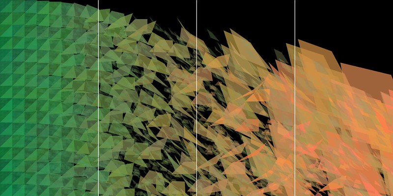
For the sake of making it easier to see the different segments, I added in some unobtrusive white lines, as guidelines. One of the major changes I did here was to make the background loop overlay the background, as opposed to being overshadowed by the main loop.
It's definitely still overshadowed by it, but it adds much more texture to the shapes, resulting in much more depth to the forms.
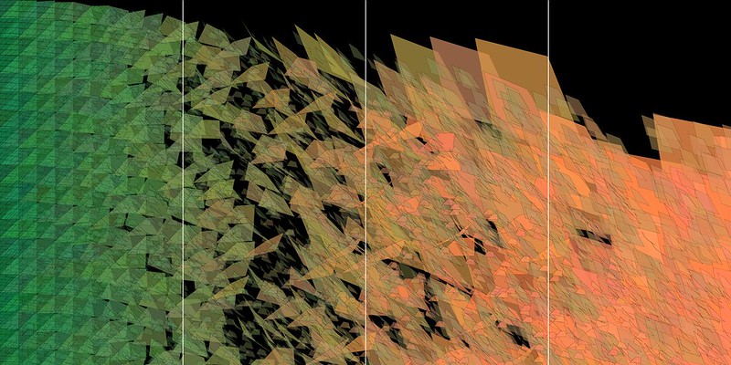
In this iteration, I tried out a 0 point stroke on everything, just to see what it would look like. I quite like it, but then I feel like it's detracting from the overall code and is just making everything a little too messy. It's not terribly effective. I also tried a white stroke, and that looked even worse. It totally loses control over how nice the code looks as just the shapes with no borders.
It's definitely still overshadowed by it, but it adds much more texture to the shapes, resulting in much more depth to the forms.

In this iteration, I tried out a 0 point stroke on everything, just to see what it would look like. I quite like it, but then I feel like it's detracting from the overall code and is just making everything a little too messy. It's not terribly effective. I also tried a white stroke, and that looked even worse. It totally loses control over how nice the code looks as just the shapes with no borders.
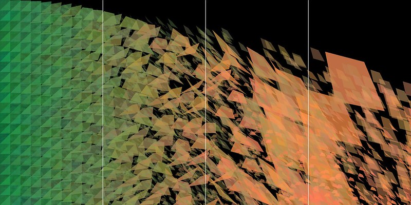
So I took the stroke away again, and then changed the code for the big loop so that the shapes don't extend across the page as far as they did before. This results in more individual shapes in the noisiest segment on the right, which I think assists in creating more noise. However, I think it might need just a few more quads there. It is just a little bit too sparse.

I kept the minimal shapes on the right for this one, but played with a shift in the colour for the small shapes. The resulting green might be just a little bit too strong. I think for my final I should go for a green shade, but maybe not as strong as the one I've chosen to go for.
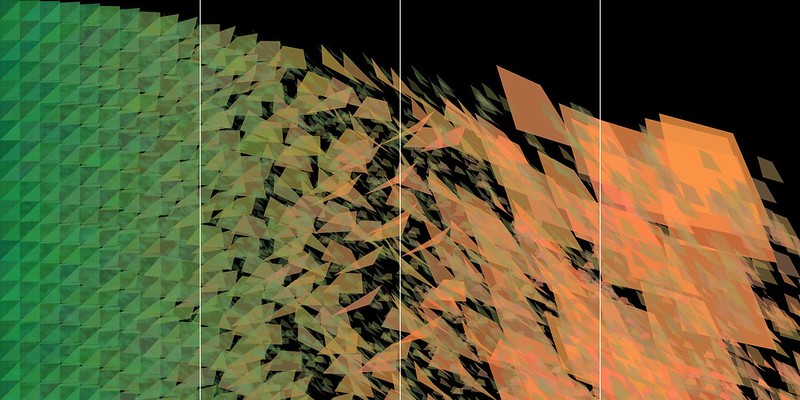
This variant here is starting to look acceptable. Since there is an inherent controlled random variable in my code however, I'll need to run the code a few times until I find one I want. Not every version is ever going to be exactly the same, so one of them will present my vision better than the rest.

No comments:
Post a Comment