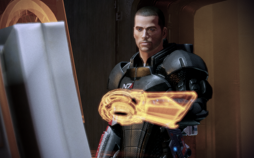
The idea is a little more akin to the Omni-tool in The Mass Effect series.
Image acquired from: http://blacksheep64.deviantart.com/art/Shepard-s-Omni-Tool-169545545
One of the ways that I want the system to differ is that rather than actually existing in the 3-D realm as a touchable, resistant hologram, it will exist inside glasses that impose the image over the arm. While this sounds unwieldy, it, unlike the omni-tool, is currently possible. It would rely on motion-tracking cameras in the glasses, coupled to a micro-computer that then imposes the visuals onto the visor of the glasses.
Where input is required, I decided that it would be best to use a series of sensors on the arm that can track the location of sensors in the fingertips, which could then feed back to the main computer providing it data that would allow it to display the appropriate input data.
These sensors could be worn as a glove and a gauntlet of sorts, or if the user was very dedicated, the miniature sensors could be implanted under the skin and into the fingers of the user, nullifying the need for a glove & gauntlet combo. Also, if the user was extreme, they could have retinal implants with a small bio-computer in their body, to nullify the need for glasses as well.
While one hand would input one section of data, for the main menu items, I was thinking it would be cool to make it a dual-input system, so that both hands are of use in the system. So, while the system is displayed onto the left arm, the left hand also has the main menu items for each screen on each finger, allowing a closing of the respective finger to activate that function.
When data input is required, the forearm has a full-sized QWERTY keyboard imposed on it, allowing for the right hand to input data there. When a map is displayed, it would also be displayed on the forearm, leaving the hand free to display important functions for the user.
This would be a rough layout for the functions on the arm. The keyboard/map/specifically-relevant-function (Current message, timetable, friends nearby) would always be displayed on the forearm, as it's the largest display surface.
The menu options would always be displayed on the fingers, with the main menu showing the paths to the other sub menus. When the sub-menus are activated, the fingers then show the relevant information for that sub-menu.
One of the main features I want to build into my design is a form of gesture control. However, as opposed to the general stereotype of gesture control, this would be gesture control of the actual display surface. What I mean by that is that the interface would show different sets of screens depending on how you hold it.
One of the most important distinctions between the gestures for this is the differentiation between public and private. The way the arm is held in the image above is certainly a more private gesture than the one below, which says "Look here, I'm showing you something.". What I want is that when the user assumes a more public motion with their arm, the data becomes visible to all people looking at the arm with the glasses on, as the data is streamed to any glasses that are pointed at the tracking points. This could be quite useful if you want to show someone something on your screen.
What I was thinking for the public screen is that since you're actually not going to input data in this mode, all the menu functions would temporarily disappear. All that would be shown to the outside world would be the data, the time, and the small notification that it's publicly visible information. A, this is far more minimalist, since you wouldn't need to show them the menu functions anyway, and B, this protects your privacy against others.
Another function I really want to build in is another shorter gesture, as if you're holding a compass in your hand, but not way out in front of you like in the previous gesture. This short, flat-handed gesture would bring up a compass-type arrow.
This part of the interface would be known as Compact/Compass mode. In this mode, the interface has massively reduced functionality, and strips the interface down to the basics of Map/Directions mode. It isolates the map system into a compass-style directions indicator, with added elements around the rim of the hand where the menu would be.
The idea for this one is that the user would use this mode while on the move. It's only got a directional compass and different bonus arrow options that would be activated by the fingers closing.
When the compact mode were to be activated without any current directions, it would activate the same mode, just minus the big directional arrow.
Another good addition (That I just thought of) would be to have written instructions running across the forearm, and each one making way for a new instruction when completed.


No comments:
Post a Comment